Real estate branding differentiates your agency and helps people understand why they should do business with you.
The real secret behind strong real estate brands is a combination of creative elements and on-point messaging into a coherent identity. This article will focus on the visual elements behind a brand. However, here you can find articles related to creating, positioning, and even growing the brand.
We’re constantly creating new website designs to inspire you. One of the most challenging things to achieve when building an agent or broker website is bringing a brand to life in digital form. Therefore, one of the essential elements of the brand is the color palette, including the leading or distinguishing color, font, and logotype. Check out our most popular website designs below.
Try it out for free!
Start Your Free Trial and use one of these designs to build your following website. If you are a do-it-yourself person, check our Knowledge Base. If you are a do-it-for-me person, visit our Services Marketplace to get professional creative help.
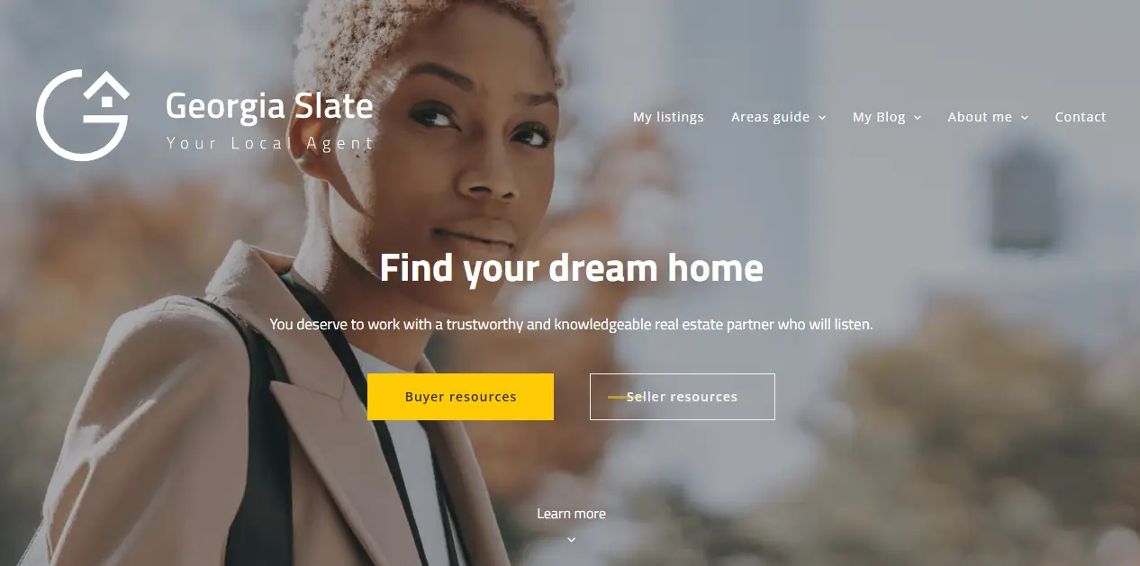
Slate Design: Strong color accent
If you want to promote your brand, this design is for you. A strong color accent adds energy and freshness. Use it at your place. Don’t be afraid to use your photo in the header. Check out what our creative experts have put together to help you get started.

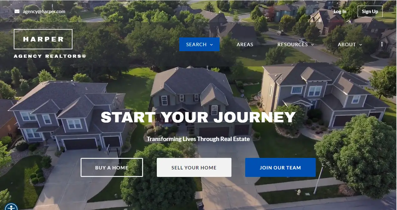
Harper Design: Boldness in modules
Animation or video in the header is not standard, but we weren’t afraid to use it in Harper’s design. Harper consists of solid theme blocks connected by an intense color accent. Large font and the use of bolds in the titles make the recipient can quickly find their way to our site.
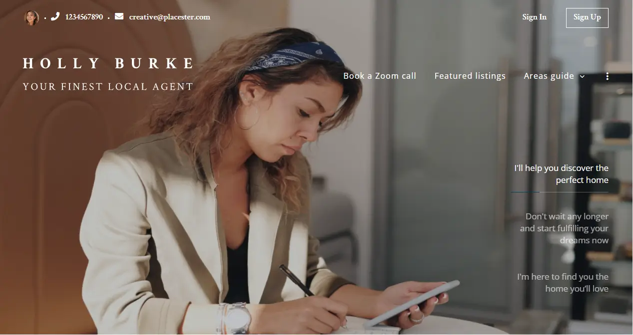
Holly Design: Bet on photos
Homepage animations, creative backgrounds, eye-catching galleries. These are just a few of the things we love about Holly. See how you can use the header to showcase yourself, your work, and your promises. Make this design yours with just a few clicks!
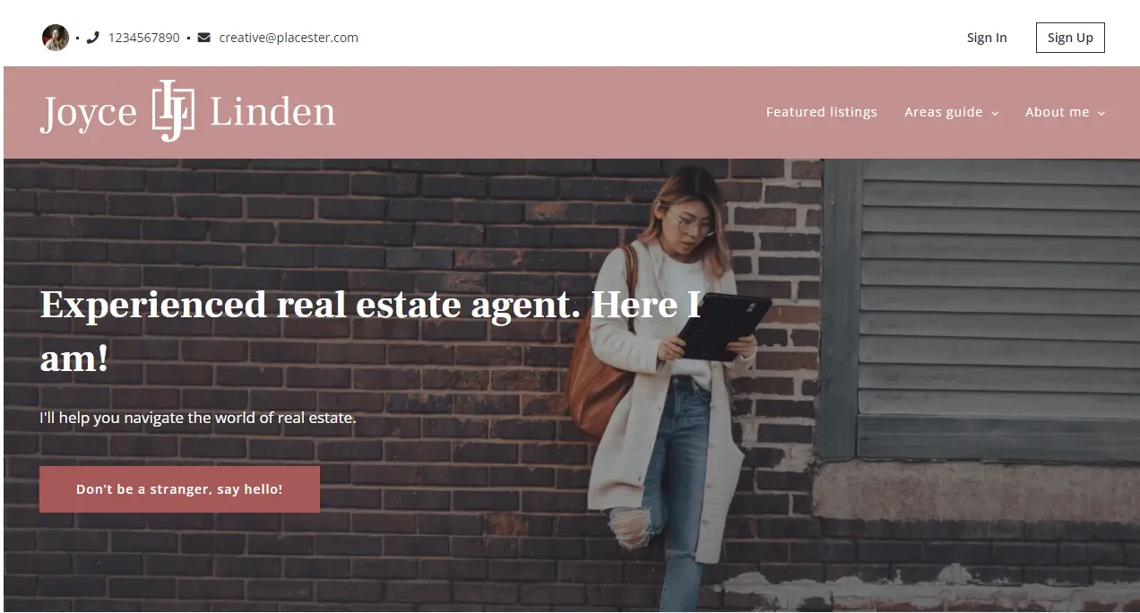
Linden Design: Subtle & intriguing
If you are looking for a subtle and modern layout to present your brand, choose Linden Design and show your best! Notice the subtle flows and animations. Little things make all the difference.
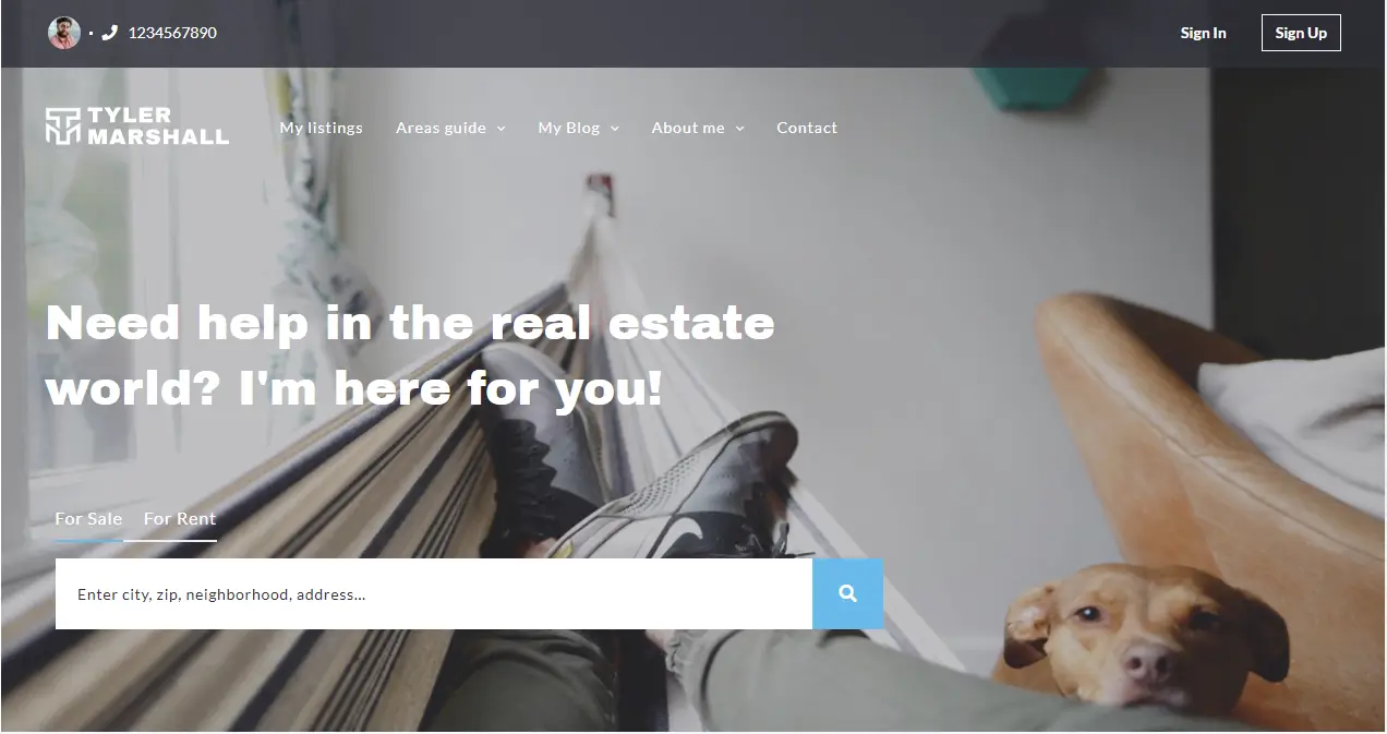
Tyler Design: Reflecting the individuality
Let yourself be your most giant advertisement. Darker color accents and a modern finish are two features that characterize the Tyler design. Choose Tyler Design to show your best side and stand out with your brand if you want to showcase personal photos!
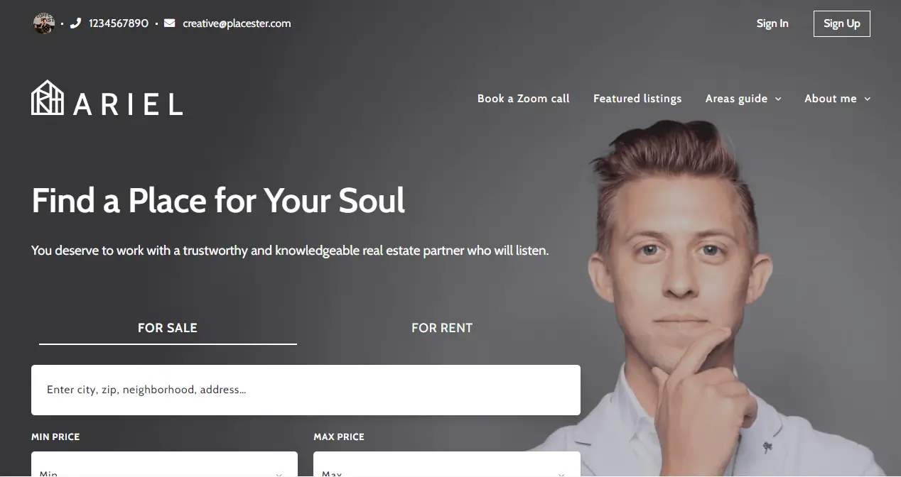
Ariel Design: Deeply thought out
Our Ariel design is not only eye-catching with excellent lifestyle imagery throughout, but it capitalizes on the new expectation that visitors should have easy access to your calendar to book time with you and conduct a Zoom call. Moreover, it’s distinguished by its header section. Laying out the search on the left and presenting you as an expert on the right show what is most important on this page.
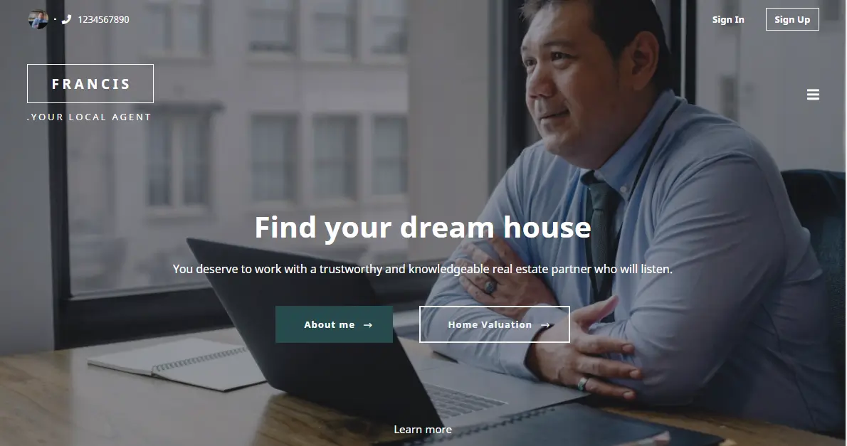
Francis Design: Barrier-breaking
If you’re searching for something that is simple but is sure to leave a lasting impression, then Francis is the pick for you. This elegant, friendly design will make your website visitors feel like they already know you before reaching out.
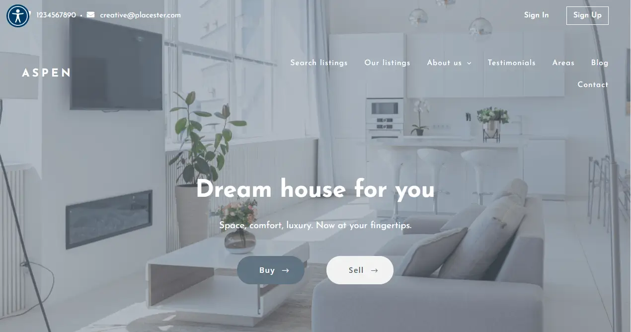
Aspen Design: Highlighting the essentials
Aspen is an excellent modern design. The choice of colors gives a sense of solidity, timelessness, and subtlety. The listing images, in this case, stand out in this tonal gray. If your main goal is to showcase the listings, then maybe this is your option. Remember that every word, image, page, and website module is editable. The best part is that you can either do it yourself or hire our services team to do it for you.
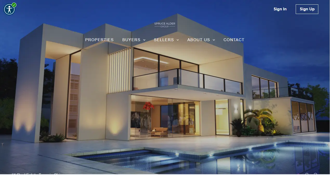
Spruce Design: Positive energy with elegance
The first-page view shows only one photo, which should reflect the type of property you are selling. The design is exquisite & browsing the site; you have a sense of dynamism. Notice the color overlay photos and the large icons used. Check out as “Spruce” has everything you need and more! You can edit every word & image on this fantastic modern site to make it your own.
Takeaways section
#1 – Carve out a niche
One way to differentiate yourself from the thousands of real estate agents is to carve out a niche.
For example, you can establish yourself as the “go-to expert” for a specific neighborhood, a type of sale, such as first-time buyers, or a type of community, such as urban or rural. These are the sort of things that can set you apart from the rest.
#2 – Invest in your online presence
As an agent, you have to be prepared to invest in your online presence, especially your website. With so many buyers searching the web for their next property, you have to make sure they can find you straight away.
Creating a mediocre website and leaving it to gather dust won’t cut it. You need a modern design with the latest news and listings for your area. Plus, you’ll want to include testimonials from satisfied clients to show visitors you’re knowledgeable and successful.
Using Placester, agents and brokers can get started with a beautifully designed and conversion-optimized site in minutes with IDX functionality built-in.
Bonus resources:
- 22 Best Real Estate Websites for Agents and Brokers
- The Ultimate Guide to Building a Real Estate Website [2022 version]
#3 – Target the channels your clients are using
Aside from a website, you’ll want to promote your brand online through social media. The key here is to target the channels your prospects and clients are using. With so much noise online, it’s best to focus on a couple of channels where you can make an impact.
Mix your content between listings, community news, and behind the scenes in your business. And make sure to listen and respond to conversations as well as posting.
When it comes to offline activities, apply the same logic, and target the areas your prospects use. For example, it may be applicable to promote your brand with direct mail, cold calling, or by hosting open houses.
Bonus resources:
- The Ultimate Guide to Real Estate Lead Generation
- The Ultimate Real Estate SEO Guide (with Strategies, Tips & Examples)
#4 – Be consistent across all channels
Whether you’re online or offline, it’s essential to keep your brand consistent across all your marketing channels.
That means your logo, colors, tone, messaging, and value proposition all need to be consistent. Use the same graphic designer for different media, such as email templates and banner ads, so that your branding is consistent.
Also, you need to be relevant, authentic, and genuine to who you are. Your personality is as much a part of your brand as your logo and brand colors. And customers expect a consistent level of service from start to finish.
Word of mouth referrals is still an important source of business. You want potential buyers and sellers to choose you based on the experience they heard about your brand from their friends and family.


