It’s no secret that today’s real estate consumers search for homes and real estate agents online. In the previous year, 90 percent of buyers went online to look at properties as their first step in the home search process. Real estate websites have become the most trusted source of information about homes for sale—ahead of agents themselves.
Here are more insights that should convince you to invest in an excellent real estate website with IDX:
- For 41% of recent buyers, the first step they took in the home-buying process was to look online at properties for sale, while 19% of buyers first contacted a real estate agent.
- Buyers typically searched for eight weeks, looked at a median of 8 homes, and viewed 3 of these homes only online.
- Nearly all buyers used online tools in the search process – 95%.
- 94% of recent buyers were satisfied with their current home-buying process.
Placester offers to create excellent real estate websites for agents and brokers that boost their branding, promote their expertise, increase site traffic, and facilitate capturing valuable leads. For those who like to create their real estate marketing websites, we provide a great platform characterized by its ability to quickly build, update and optimize an effective online presence for real estate business. We’ve seen countless REALTORS® use Placester websites to their advantage!
Whether you’re looking for a new real estate website provider or an existing Placester user curious about how others use the platform, we’ve collected the nine best real estate websites powered by Placester in 2023, each with its own unique flavor and strengths.
Best Websites for Real Estate Agents
Kim Spears Group

Keeping your branding on point across one website is difficult enough. Kim Spears has delivered a consistent experience across three custom Placester websites—two for her real estate practice and one for her interior design business. Each site is memorable with custom logos, pixel-perfect header images, and cutting-edge design. Together, they form a compelling real estate brand.
Website highlights:
- Kim provides a detailed about page with a hi-res professional head shot.
- Kim offers an extensive network of area pages for all the planned communities she serves.
Deborah Camuso

An active agent in both Cape Cod, MA and Westchester, NY, Deborah Camuso has an innovative solution to addressing each of her audiences. Rather than lump listings and content for both markets into one site, Deborah has created a homepage with links to two separate Placester real estate agent websites: one for Cape Cod, one for New York.
Regardless of which digital door you walk through, both versions of Camuso’s custom-designed website feature lots of valuable content to help home buyers and sellers find what they’re looking for.
Website highlights:
- Videos for active and sold listings are featured on a dedicated page on Deborah’s site.
- 3D home tours powered by Matterport help Deborah promote the listings she represents.
Debbie Gates

Built on Placester’s Wilshire real estate website template, Debbie Gates’ Placester site is clean and minimal, yet packed with plenty of fresh content for both buyers and sellers, including navigation links to Debbie’s newest listings and resources for sellers and buyers. Debbie’s site also offers a huge library of real estate testimonials, demonstrating her experience and skill.
Website highlights:
- Debbie’s site features coming soon and sold listings on their own separate pages.
- A “Recommend Us” page includes links to Zillow, Yelp, and Facebook, along with a form for visitors to submit a testimonial directly through the site.
Catherine Zerba

A real estate agent website is more than just a business card or search page: it’s a tool to sell yourself to prospective clients when you can’t be face to face. Catherine Zerba uses a mix of content on her Placester website (designed by AgentSiteBranding) to effectively pitch her brand and expertise to visitors, including a sold listings page and great testimonials.
Website highlights:
- Catherine’s about page lists her many credentials, awards, and achievements, as well as her personal history.
- Catherine maintains a blog to promote new and “coming soon” listings in her inventory.
Doug Rains

Many consumers expect agents to be available around the clock. Doug Rains has leaned into those expectations to build an effective brand. Dubbing himself “The Responsive REALTOR®,” Doug uses every inch of his custom Placester website, which uses Placester’s Beacon real estate website template, to illustrate his commitment to addressing clients’ needs right away.
Website highlights:
- Doug’s blog is frequently updated with tips and advice for potential clients.
- Doug’s menu includes a “Free Stuff” page with a laundry list of helpful links for both buyers and sellers.
Far West Sonoma

REALTOR® Lou Rosenberger clearly understands the impact of great photography, choosing a beautiful full-width image of a picturesque landscape in his native Sonoma, CA. Lou’s website, built with Placester’s Newbury template, also includes testimonials with images of past clients’ homes to illustrate the kinds of properties Lou deals in. Finally, Lou makes use of Placester’s Content Library to fill out his real estate blog with informative content for visitors to enjoy.
Website highlights:
- Lou’s site keeps visitors up to date on real estate trends with detailed market reports like this one.
- Lou has created a network of area pages for the major regions in his market, as well as individual towns and zip codes in each region.
Debbie and Lauren McCauley

Debbie and Lauren McCauley use Placester’s Chicago theme to market their expertise to consumers in Cardiff, CA. Prospective buyers and sellers will find a long list of satisfied clients on their testimonials page. Debbie and Lauren also use Placester’s area pages to offer visitors everything they need to know about several communities in the Cardiff area, including addresses and phone numbers for local utility companies, schools, and emergency services.
Website highlights:
- A recent sales page offers images, descriptions, and sale prices for the many transactions Debbie and Lauren have closed.
- Debbie and Lauren each have their own dedicated about page with a detailed bio and contact information.

Broker age & Team Websites
Apart from the standard features and easy-to-use interface, IDX websites for real estate brokers should include more information and options than an agent’s page. Brokerages and teams typically put more effort into building a brand, which should be reflected in their digital communication – via a more extensive about us section, success stories, or branded resources. The team presentation is essential, too. It’s good to include every agent’s bio and contact information on the website – not only for prospective buyers and sellers to see but also for young real estate professionals looking for a team to join.
See our favorite real estate websites for brokers done by Placester in 2023.
Wiseman Properties
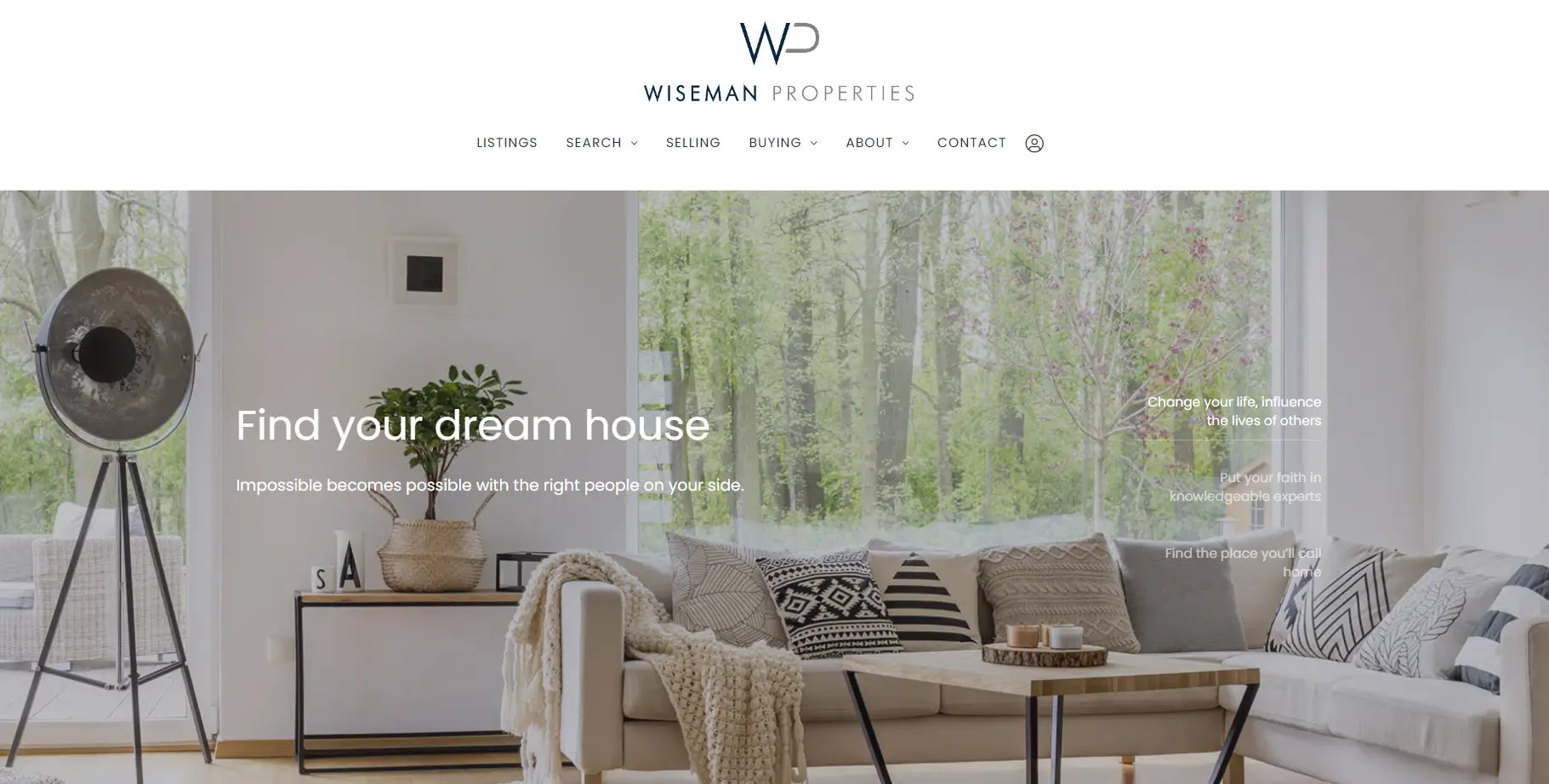
Wiseman Properties’ website is one of a simple elegance that will speak to clients of various tastes and needs. The website’s design brings to mind professionalism, reliability and trustworthiness.
Website’s highlights:
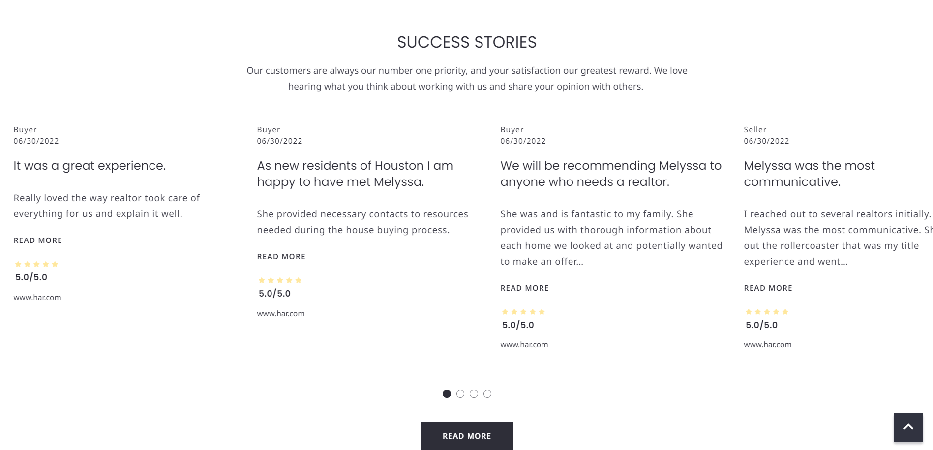
Up – to – date testimonials
Probably every realtor has a bunch of flattering testimonials up their sleeve. Testimonials are super important when it comes to building trust, but in order to make them even more effective, you can add a date that will tell your website visitors that these testimonials are up-to-date and you continue to be a successful agent.
Join our team subpage
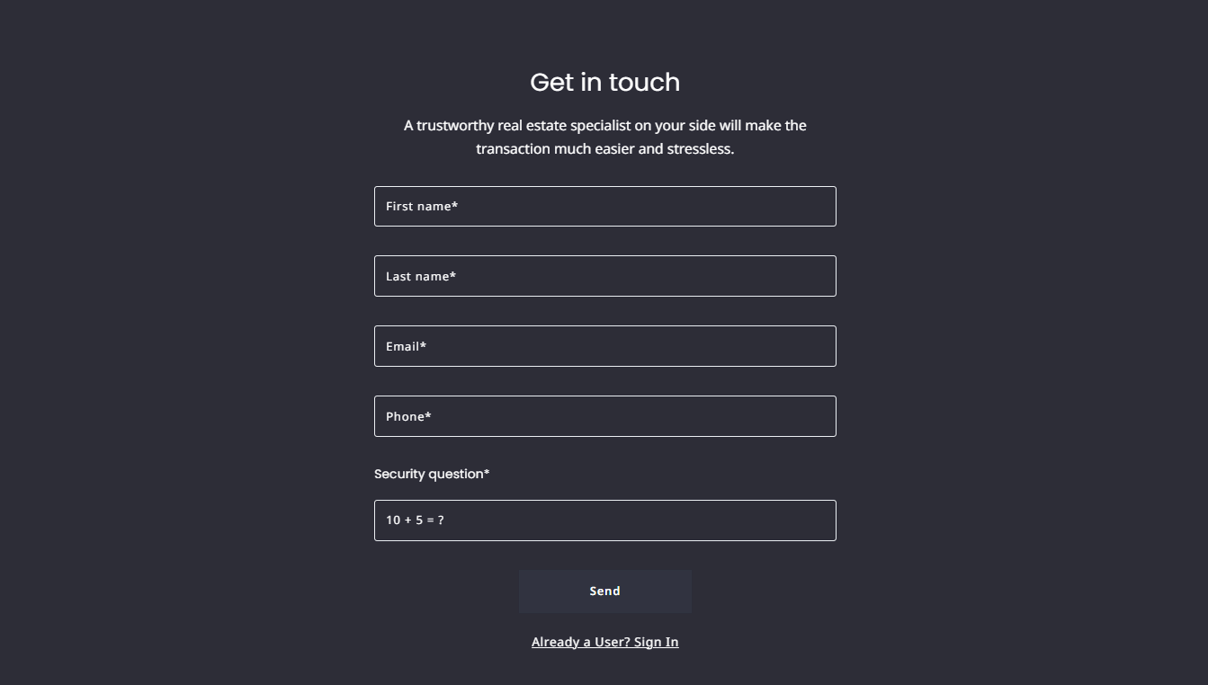
If your team or brokerage is hiring, not having a contact form for job seekers is definitely a mistake. Young real estate professionals will use the internet to find brokerages to work for and if they are already interested in your company, they won’t miss a chance of getting a job.

Pop-ups
Pop ups are one of the most effective ways to capture new leads. In order for them to be effective, they have to be placed in strategic places on your website and convince your visitors to leave their contact information.
Neighborhood grid
Weisman Properties website has an Instagram-like grid displaying areas they operate in. It is visually appealing and very intuitive in use/
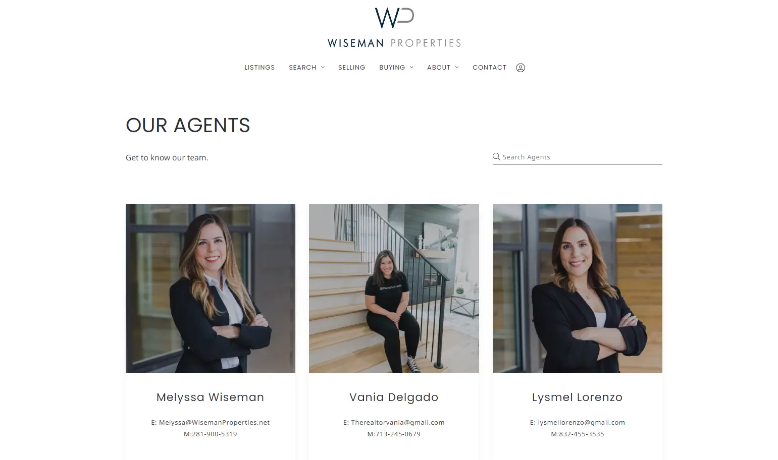
Our Agents section
We can never underestimate the importance of the team presentation on the brokerage website. Wiseman Properties’ Our Agents section is very simple yet effective.
Talford Realty International
Talford Realty International is a full-service real estate brokerage to both mid-range and luxurious clients in South Carolina. Their website reflects the character of their business perfectly, with a high-end, yet approachable real estate website design and a functional navigation.
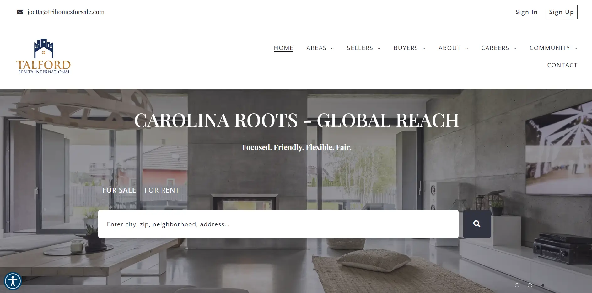
Website’s Highlights:
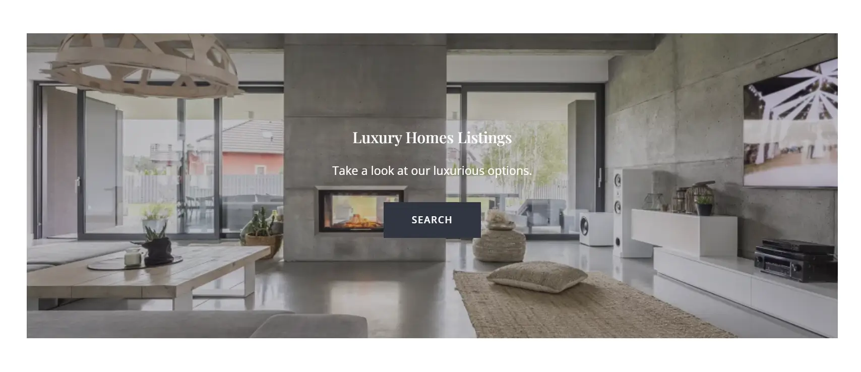
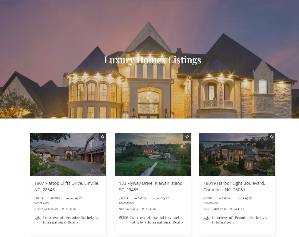
Separate Luxury Listing
If you engage with luxury real estate apart from your regular everyday deals, there is no need to create a separate site to cover this area of your activity. Talford Realty has a luxury listings bar on the mainpage with a CTA linking to the whole subpage dedicated to high-end properties. Although the subpage has a slightly different tone, it is still coherent with the rest of the website.
Agents subpage
Talford Realty International has an outstanding team subpage – an effect that didn’t take a lot to achieve. In the header, you will find a group picture of the whole team, which is a great way of communicating the good spirit of the brokerage. Below, you will see a grid with every agent’s business card with all the information you might need. Apart from the standard ones such as a phone number and an e-mail address, there are also social media links so that a visitor can get to know the agent better.


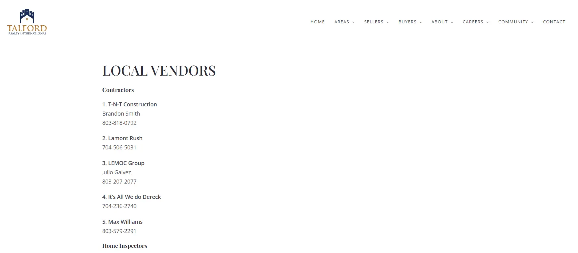
Local vendors
We’ve said it many times before – partnering up with local professionals related to real estate is always a win-win game. Talford International Realty has a whole section dedicated to local vendors and professionals – carpet cleaners, attorneys, contractors and many more. Your potential buyers and sellers are going to need this kind of service!
Event Calendar
Make every opportunity to get to meet you known. Talford Realty International uses calendly integration to make it possible for website visitors to schedule appointments and consultation, join career nights organized by the brokerage or take part in an open house event.
Ping Flamingo Realty
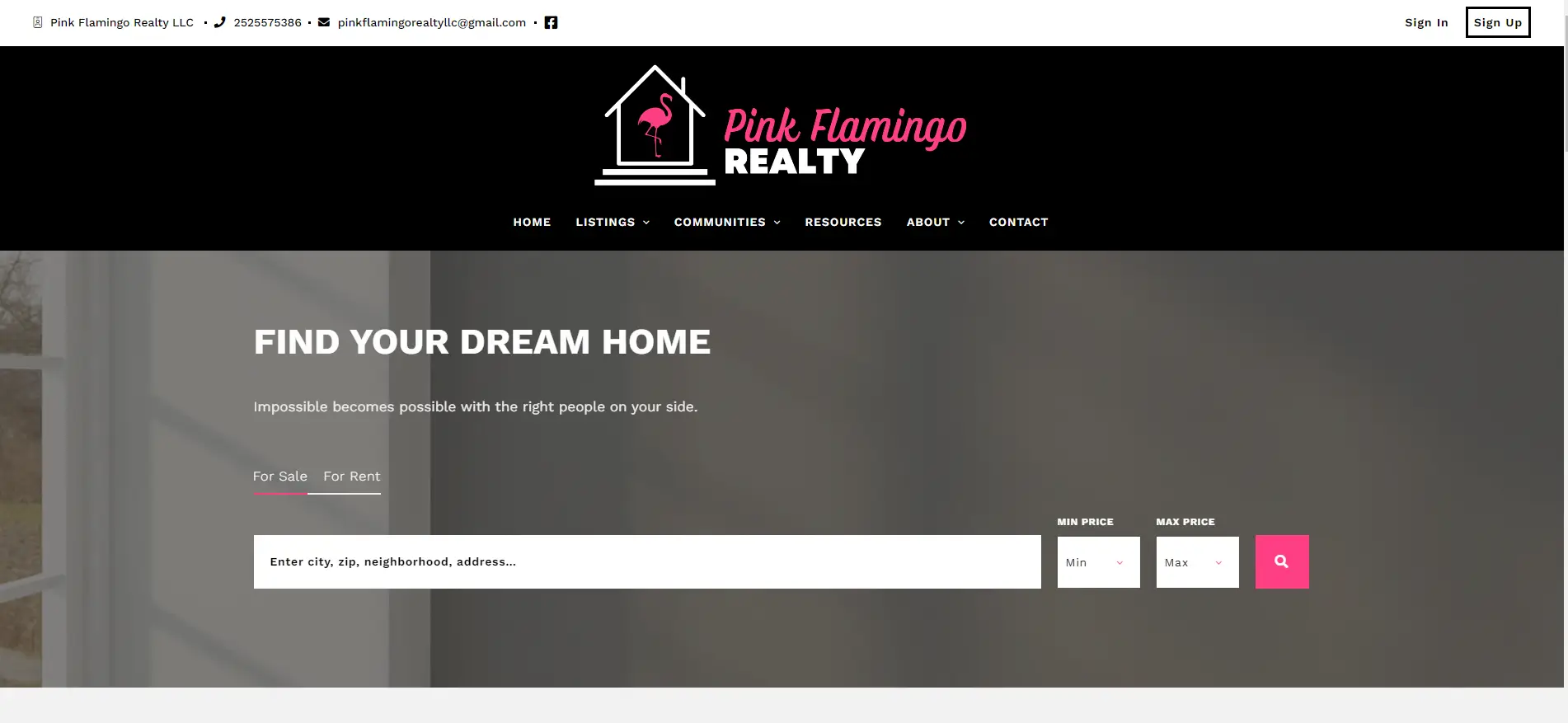
As the name suggests, Pink Flamingo site is definitely one of a kind, with the whole design acting in sync with the branding. Bold pink and animated grids make the user experience unforgettable – browsing this website is pure pleasure.
Website’s highlights:
Bold design
Strong fuchsia accents is not a typical go-to color for realtors to choose, but it absolutely makes sense for Ping Flamingo Realty. Given the color’s distinctness, it takes a designer’s intuition not to make it over the top. Thanks to the thoughtful use of the color, the effect is stunning but not overwhelming.
Animated grids
To add some playfulness to the website, the designers decided to implement animated grids. It is quite an unusual solution for a realtor page, but, again – it goes great with the Pink Flamingo!
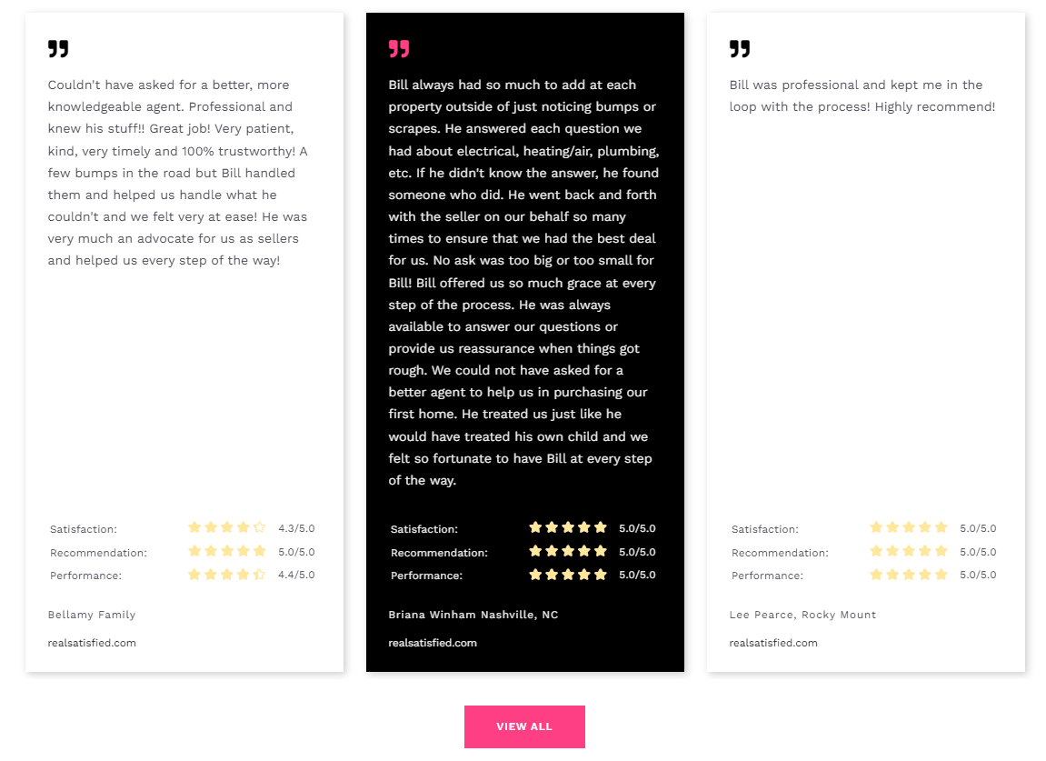
Great testimonial section with yellow stars that stand out
Users don’t like to read a lot but they want to get as much information as possible. With this in mind, apart from the text in the testimonial section, you will see yellow stars which convey the message of a successful cooperation with the agent.
Search bar
Visiting Pink Flamingo website, you can proceed to searching property listings right away. The search bar for properties for buy and rent is located in the center of the page – the user will start browsing before they notice!
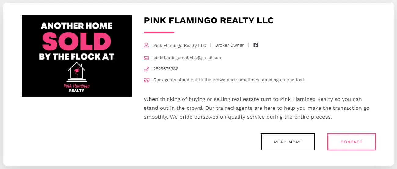
Exceptional bio with all the contact information
We have managed to squeeze all the relevant information on one bar: you get to read Bill Lumpp’s short bio, get through his social media and call him immediately without even scrolling through the page.
Stony Brook & Lennox Realty
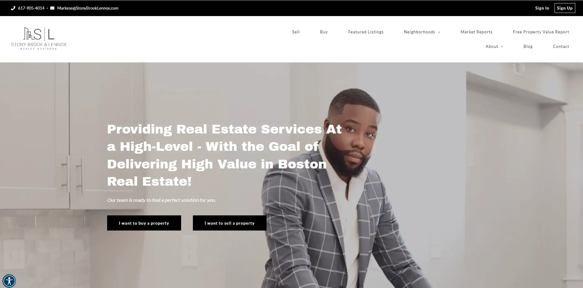
If you want to create a strong personal brand, your website is the right place to tell your story with words and images. Stony Brook & Lennox Realty based their narrative on one figure – the founder & CEO Markese Daise, whose silhouette is present throughout the page. Linking the services to a face builds trust and makes a more lasting impression.
Personal Brand
Markese’s pictures are seen in the most strategic places on the website. That’s a great way to get remembered by visitors who, most probably, browse through many agents’ and real estate brokers’ websites in search for the ideal one to work with them.
Sold listings grid
It’s a great way to tell a story of your efficiency and successfulness. Stony Brook & Lennox Realty have their sold listings displayed on the main page, together with the selling price.

Mortgage calculator on the mainpage
It is crucial to invite visitors to take actions while they’re still on the page. There are many ways to do so – from various CTAs to contact forms, pop ups and gated content. Another way to make people stay longer is to place a mortgage calculator right on the homepage.

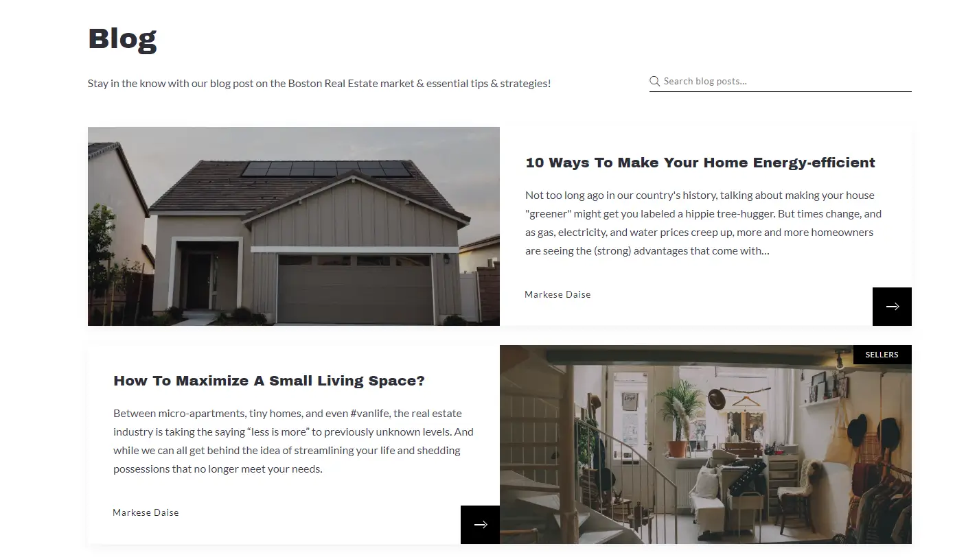
Eye pleasing blog
Rather than long blocks of text, Stony Brook & Lennox Realty’s blog has an eye-pleasing layout that is designed according to the latest knowledge on how a human eye moves on the website.
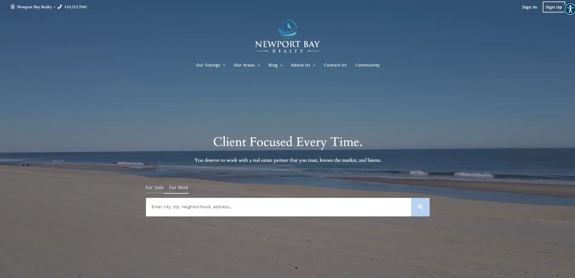
Newport Bay Realty
If you operate in an area that is in any way specific, make it your website’s main theme. That’s how Newport Bay Realty benefits from the website’s marine-inspired design and beautiful pictures and videos from the area.
Website’s Highlights:
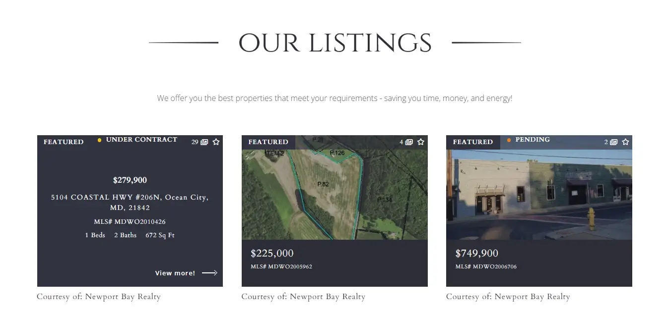
Listing grid with a hover effect
The featured listings are displayed in an engaging way that will not be boring to the human eye. Using the hover effect, the images act as flashcards, showing the property’s all information.
Social media grid
Invite people to reach out to you on social media and follow you there – this way they won’t lose sight of you. You can place social media icons on your main page, but if your Instagram / Facebook content is interesting and engaging, it’s even better if you have a grid with your latest post – it shows your web visitors why it’s worth following you there!
Join Placester
Did you like the websites for realtors you’ve just seen? If you could capitalize on all the tricks, features, and online tools we offer, don’t hesitate to see what we can do for you! Our approach is based on the human touch. It provides solutions to every real estate agent’s or broker’s needs – from design to technical solutions that open doors for successful listing communication and lead gathering through custom websites with an IDX search.
.


