Your website has the potential to be your best brand and sales asset, but that potential won’t be achieved without website optimization. This guide will help you understand which real estate website components to focus on to solidify your brand and generate more leads. Learn which pages, modules, and finishing touches you can add to your website and why they’re good for real estate.
- Why a real estate website is your biggest asset
- Creating a website with purpose
- Determine your site’s target audience
- It pays to plan your website
- Start with a creative outline
- The starting point strategy
- Where to build a real estate website
- The first pages to tackle for basic marketing
- Trying on designs
- Displaying listing search
- Sharing more about you
- What to ask your website vendor
Who is this for:
You are:
- A real estate agent, office manager, managing broker, admin, tech lead, or
- anyone else who operates a real estate website, or who manages people who operate real estate websites.
- Knowledgeable about the process of buying and selling real estate. You’ve worked in real estate, in a brokerage, with other agents, brokers, admins, and assistants, and you are seeking to understand why websites are important and what components you could include on yours.
- Interested in learning how you can structure and maintain your website to effectively generate new business, establish your brand’s trustworthiness, and stay top-of-mind with the clients you already know. You are eager to learn more, while recognizing that there are no silver bullets.
You want:
- To understand enough to build a basic real estate website and fold it into your marketing strategy.
- To create a website that resonates with buyers and sellers in your area and your niche.
- A website that looks professional but won’t require software engineering experience to construct.
- To know how to support your wider marketing efforts through your real estate website.
- To be super-effective supporting others with real estate website needs.
- To leverage the power of the internet to connect with and inform your leads and your sphere of influence.
- To get a sense for what elements work well (and why) on a real estate website.
By the end of reading this guide, you will:
- Understand why real estate websites are critical for an agent’s business.
- Know exactly which website ingredients are essential and which make the icing on the cake.
- Be able to prioritize the website projects that will best support your lead generation priorities.
- Know how to talk to developers, designers, content writers, and the rest of your website support team.
- Understand how to integrate your SEO efforts with other marketing strategies, such as social media.
- Discern what makes your competitor’s websites excellent (and how to iterate and improve on what you’ve learned).
- Be able to identify the most important next steps to take to elevate your website above the competition.
Let’s learn how to build your ultimate real estate website.
Why A Real Estate Website Could Be Your Biggest Business Asset
You not only need to ensure your website communicates your brand effectively and distinctively, you must have it serve as your 24-hours-a-day sales force. Your website holds the potential to be your company’s most powerful marketing tool.
Real estate agents spend a lot of time online, and most of them also understand that their clients spend a lot of time online, too. Buyers are researching the home transaction process, trying to understand mortgages, and browsing listings; sellers are brushing up on home decorating trends, determining which projects they should finish before listing (and which should wait for the new homeowners), and reviewing recent list-to-sales prices for their neighbors.
The National Association of Realtors’ most recent Profile of Home Buyers and Sellers showed that more than half of buyers start their home purchase journey online. Here is the summary of first steps that buyers take, according to NAR:
- 44% look online for homes
- 17% talk to an agent
- 11% look online for information
- 7% contact a mortgage lender
- 6% talk to a friend
- 6% drive around looking at homes
The majority of consumers turn to the internet first when they’re interested in buying a house, which means that to be the first real estate agent to make a good impression on those consumers, you need an internet presence. That said, throwing up a one-page website listing your name, contact information, and “real estate in My Town” is not going to generate many (if any) leads.
Most real estate agents are missing an opportunity to engage with their future clients before they even know that person is a lead. When a buyer or seller finds your website, it should be overflowing with value, enticing visitors into a rabbit warren of real estate information and advice.
Our guides on real estate marketing, lead generation, and SEO all take it as a given that you have a website for your real estate business. But what exactly needs to go on that website? What should it look like? How can you use it to showcase your niche areas of expertise for the types of clients you specialize in serving?
We’ve scoured some of the best agent, team, and brokerage websites online and broke down the components that helped to build their success. No real estate website has every last one of these features, but all of them have the basics (including IDX search), and most combine more than one component to deliver a satisfying visitor experience–and generate more warm and hot leads.
Let’s dive in!
Building Your Real Estate Website with Purpose
Whether you’re building a website from scratch or optimizing an existing one, approach the project with the mindset of strategy first, execution second. Your planning process should be purposeful and thorough.
Five focal points of a website
“A strategic website’s core purpose is to serve, support and sell,” writes author Lorrie Thomas in The McGraw-Hill 36 Hour Course: Online Marketing. Thomas presents a five-pack of components that should be the focal points of your website.
- Credibility – Your website needs to establish credibility to gain the visitor’s trust. It needs to make a strong first impression and continue fostering credibility with every piece of content presented
- Usability – Users must have a positive experience interacting with your website. Usability is a function of your website’s design, architecture, navigation, call to actions, and content.
- Visibility – Visibility is a crucial component of your website and online marketing at large. Visibility might come from any combination of marketing channels, including advertising, search, social media marketing, PR, and email.
- Sellability – With its pages, posts, images, videos and any content, your site must answer the question, “Why should visitors do what you want them to do?” Your value propositions must come through clearly.
- Scalability – A healthy website is developed to accommodate ongoing expansion. Ideally, you should be able to scale your site easily without a continuous dependence on the services of coders and IT professionals.
Determine Your Site’s Target Audience
Let’s face it: your website isn’t just about you. After all, the main reason you even have a site is to attract visitors that you can build into a tribe and later convert into supporters, leads and customers for your business, right?
So shouldn’t you cater your website – and the experiences you provide there to those very visitors? When people land on your website, they usually ask themselves, “What’s in it for me?” And when building a brand, you need to be able to deliver an experience that makes it clear to those visitors exactly what’s in it for them, and why they should care.
That’s why it’s so crucial to craft your website’s design, content, and experience with your audience personas in mind. WARNING: you shouldn’t skip this step (though many do).
Persona development is an important step in minimizing the risk of drinking your own kool-aid and instead creating an experience tailored for your website visitors.
Developing user personas will help you build a website that resonates with visitors, motivates content sharing, and converts better.
Check out also: How to Build an Effective Website Header in 3 Easy Steps
Here are some ‘Who” questions to help hone in on the right audience:
- Who are the people that will pay you? – This is your primary target, It could be your buyers or your dream sellers. It may be the agents that work in your brokerage or the agents you plan to recruit. It could also be real estate investors or developers who desperately need a good marketing and sales partner to work with.
- Who are the people that Influence those that pay you? – These are the people that hold the attention of the people that pay you. Think local, respected and connected.
- Who are the influencers in your market – Take a look at the most prominent businesses, business leaders, bloggers, event organizers, party planners, developers, journalists, authors, podcasters and subject matter experts in your market.
- Who are your supporters? – Call them tribe, network, ambassadors or super-fans-just don’t ignore them. These people believe in you without hesitation, are willing to connect you with others and happily tell the world about the value and importance of what you do. This can be your family, friends, colleagues, co-workers, advisors and anybody that can lend a hand as you work your way to your vision.
- Who’s in charge of the next step of your business growth? – Could be your clients, future clients, investors, competitors, or your boss’s boss.
- Who are the people most interested in your expertise? – Who, if they heard your message, would benefit from it most.
The questions above should help get your creative juices flowing and help you start to narrow down some of the “Who” in your persona development. Remember, not everyone is your target audience. Be specific and be selective.
Next step is to get personal with some “What” questions relating to your audience:
- What are their ages?
- What is their sex?
- What do they do for work?
- What do they do for fun?
- What is their family situation?–Single, married, divorced, engaged, partnered, children and pets all count.
- What are their hobbies?–Minecraft or Golf, Crossfit or X-Games, each one says a lot about what excites them.
- What do they read?–Digitally and physically–Books, Kindle, Newspaper, Blogs. Get as specific as possible.
- What technology do they use?
- What is their favorite means of communication?–Email, phone, Facebook, text or in person
- What social media channels do they participate in?–Facebook, Twitter, Snapchat, Instagram, YouTube or Pinterest and present different ways in which you will need to communicate with your target audience.
- What Conferences do they attend?
- What podcasts do they listen to?
- What is their motivation?–Are they struggling for survival, looking to become a better mom or searching for the meaning in their life.
- What is important to them?–That you can help with
- What are their biggest challenges?–Where you can provide answers or relief.
Go so far as to write down the names of 1 or 2 people that most represent the quintessential target audience. While there are many other questions you can ask to better you understand your target audience, this is a perfect start.
These user personas will serve as fictitious characters that represent the people that visit your website.
When completed, a single person represents a cluster of visitors who exhibit similar motivations, attitudes, behavioral patterns, and needs that you will use to guide your website development. You are building the site for them, your target audience.
It Pays To Plan Your Website
Serious real estate marketers recognize a website that will deliver a bountiful return on investment needs to be created by experts.
Hire professionals making sure your team includes talent to cover the key areas of website production including:
- Copywriting
- Graphic design
- Development
- Search engine optimization
- Conversion
Start With A Creative Outline
While the actual number of players on any given website development team will vary, it’s fair to say some form of collaboration will take place. Therefore, you need everyone on the same page from the get-go. Your web marketing creative brief is literally that page.
A carefully completed brief should provide insights and guidance to successfully take your project from concept to completion. It should articulate a set of objectives and summarize all the factors that will impact the website’s development.
Your creative brief might comprise the following:
Background information–Document the basic who, what, when, where and why information to set the stage. Consider opportunities worthy of discussion and relevant challenges you’ll face. Round up existing research, reports and other documents that will help get the ball rolling.
Objectives–What purpose will the site serve? List the most important objectives.
Audience–Who will the site serve? What do they think? Why should they care? If you haven’t already developed personas to define your target customers, now may be the time.
Competitors–Identify and analyze competitors. Establish what they do on their websites that might inform some of your content. Then, of course, establish how you’ll differentiate your site.
Tone–How will you communicate? Try listing adjectives that will describe the feeling you’re going for and approach you’ll take.
Message–What needs to be said? You’ll likely want to get into an expanded messaging exercise with your writer (or even writers, plural, for various parts of the website). For the brief, aim to capture the high level messaging likely to be applied on your home and about us pages.
Visuals–Describe the visual style you favor. Will you use photos, illustrations, diagrams, and videos? Will the visual style complement other marketing efforts? What assets do you have and what will you need to acquire?
Design preferences–Branding considerations go here including preferred colors, fonts and required logo marks.
The team–Who’s in charge? How will approval processes be managed? Who needs to be in the loop and how will progress be reported team-wide?
Additional details–Consider all that apply to your project:
- Mandatory information
- Existing assets
- List of deliverables
- Preconceived ideas
- Formats
- Limitations and restrictions
- Schedule
- Budget
The starting point strategy
When working with your creative team, you’re bound to find it difficult to describe the look and feel that appeals to you. It can be a very abstract process. Perhaps you have no idea where to begin.
We propose the “starting point” strategy, which simply calls for referencing designs you like. Go web surfing in search of real estate websites that feature design ideas and elements that turn you on. Try any or all of the following:
- Review the sites of 5 – 10 competitors in your field. Search for similar companies in another city.
- Search for something along the lines of “great real estate (agent, broker or team) websites” You’ll discover some website inspiration quickly.
- Visit website award and talent sites such as Awwwards, TheBestDesigns, Dribbble and Behance and search for real estate websites.
- Build a collection of websites you like from outside of real estate.
Make notes regarding the elements and copy you feel are a fit for your website and share them with your team. Mix, match and make these strategies work to serve your purposes. It’s not stealing. It’s simply a great starting point.
Where To Build Your Real Estate Website?
You have several choices when it comes to building a real estate website. But, before you decide where to build your site, you’ll want to pick your strategy:
- Use code in the form of a developer or custom designer to make your site, or
- Go Codeless and use a visual-based system that allows you to create a website without the need for specialized skills.
Code vs Codeless
Suppose you want to build a website unlike anything else online, with unique data feeds and complex integrations. In that case, it’s better to hire an experienced team of developers who can create a complex yet unique website for your business.
These teams are highly skilled at building complex websites according to your specific requirements. Also, depending on your arrangement, they will execute change orders during the development process and for a set period of time after launch.
Codeless platforms specialize in letting users with no coding expertise create reliable websites and integrations easily. Even non-techies can leverage these visual-based systems to build complex websites from scratch with drag-and-drop modules, pre-built integrations, and configurable widgets.
Moreover, no-code platforms provide robust templating systems to create design starting points that allow for rapid iteration and customization. You can create live prototypes and work on content, images, and copy at the same time.
Squarespace, Wix, and Weebly are a few of the most popular no-code website builders if you don’t need IDX real estate search on your site.
Placester’s Codeless platform is the first no-code website builder purpose-built for real estate. You can easily use one of these platforms without worrying about long development lead times, scalability, or design flexibility.
WordPress is another option, though it generally requires a developer’s help to make it work for real estate.
Regardless of the path you choose, shop around, and ask to take any serious contenders for a test-drive. Note: If you have to buy before you try or are forced into a long contract, that should signal some warning bells to keep looking.
These tools are reducing the amount of time and coding expertise required to translate an idea into something people can use. You no longer need to become a programmer to build things on the internet, empowering a new wave of makers from different backgrounds and perspectives.
– Ryan Hoover, founder of Product Hunt,
in The Rise of “No Code”
Identify your website marketing team
Before you sit down and start building your website on whatever platform you’ve chosen, you’ll want to think about who is going to do what. Think about what you want to accomplish and what tasks you want to do, what to delegate and what to outsource. Consider the different ways you can configure and promote your content so that you can start experimenting.
Don’t forget about images; you’ll want to find a good source of high-quality and fair-use images (always credit your photographer). And figure out who is going to write the words. You should have somebody proofread the copy–or preferably the entire website–before it goes live so you can make sure there are no typos and that the punctuation and capitalization is consistent and looks professional.
And remember that the website isn’t going to update itself. Written or video blogs will need to be populated regularly with fresh content. Swapping out winter-driven images for springtime ones, adding new data to a market report, adding a new frequently asked question to your FAQ section: Those are all tasks someone is going to have to undertake.
Whether that’s you or a designated helper is entirely up to you and your business, but even if you think you want to be 100-percent hands-on right now, you should absolutely set your website up so that someone else could take over for you at some point in the future. Maybe you have all the time in the world to fiddle with pop-up settings as a fresh agent, but when your business picks up, that time will suddenly be in short supply. Consider hiring creative help on-demand to help you get things set up but make sure that help understands all of the complexities of real estate. Take a look at Placester’s On-Demand Services Marketplace to get a sense of what’s possible.
Basic Marketing Needs: Landing Pages, Contact Info, And More
There are some components that every real estate website should include simply because they make a ton of business sense. Why bother going to the effort and expense of creating a real estate website if you can’t capture lead information or tell them how they can contact you? Exactly.
Whatever platform you use or website you build, it should be able to do or should inherently include these things
SEO-friendly
Search engine optimization, or SEO, is how you tell the search engines (namely, Google) about your website pages and climb the search engine results positions (SERPs). You might anecdotally understand why SEO is a powerful tool to use with your website because you’ve used Google before and have clicked on results yourself. But did you know that the top result on Google gets almost a full one-third of the clicks for that search? And that every position you climb can boost your click rate by (on average) 33%?
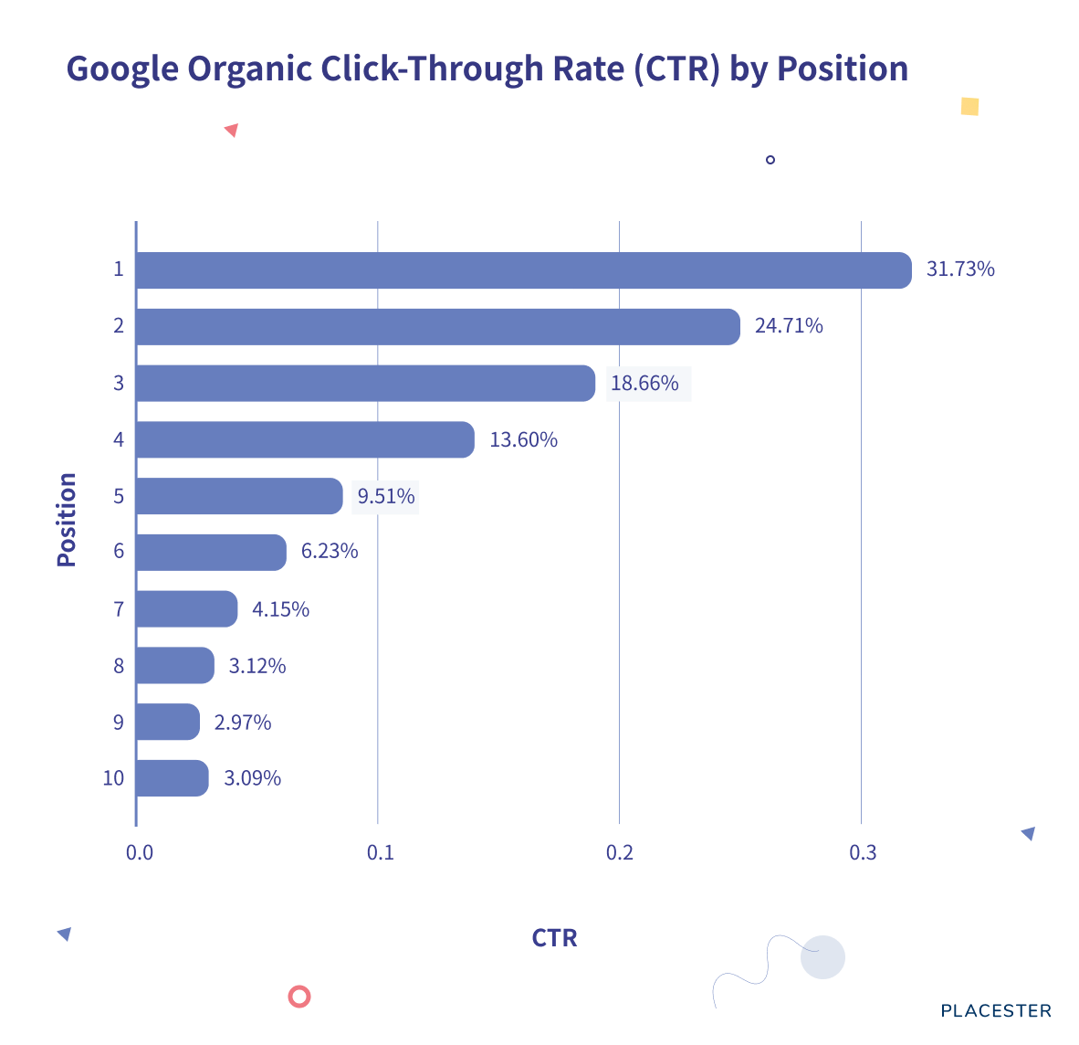
So how do you get to the first page of SERPs, or to the very top? That’s a topic worthy of its own guide (and we wrote one), but some of it has to do with how different parts of your website are set up, such as the URL. For example, your website should ideally encrypt requests and responses using an SSL certificate. You can see when a website does this because the URL includes an “s” in the code at the beginning: It’s the difference between http:// and https://. That’s just one thing that Google considers. Your website platform should also include the ability to edit page titles and meta descriptions, include schema markups that give Google additional information (such as the exact location of your business), and support a rich keyword targeting strategy.
Al Waddell’s website targets luxury and historic homes in Columbus, Ohio.
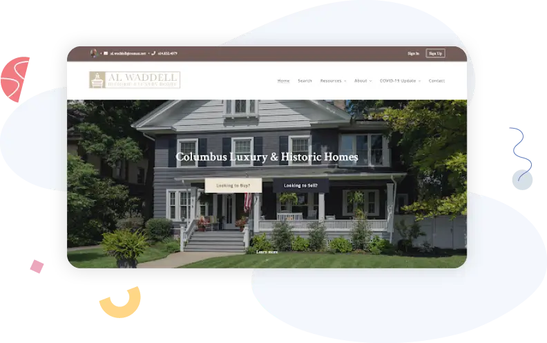
His website dominates the search results for “columbus historic homes,” showing up at the top of both the map pack results and the organic search results.
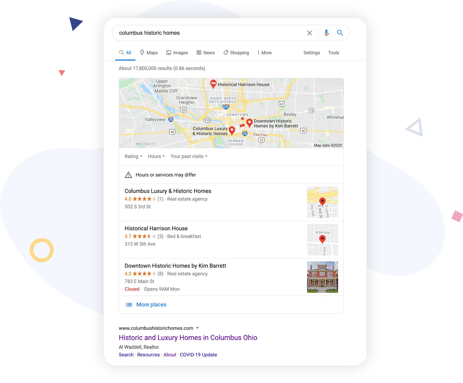
That’s partly because the website does a good job of satisfying visitors by including several components that we’ll discuss later, but it’s also because the website is technically SEO-friendly.
Contact information
There’s almost no point at all in having a website if you don’t include your contact information on it. The best websites will allow you to embed your contact information in the footer of the page so that visitors can see it and access it across every page of your website.
On the GENS Realty website, they display all of their contact information in the footer so making a phone call or sending an email is only one click away.
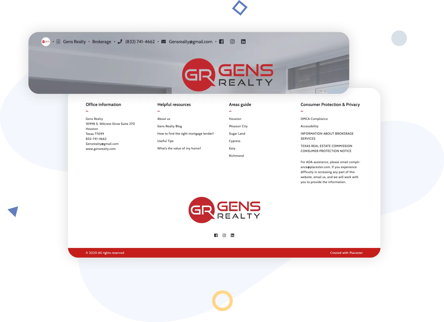
GENS Realty also includes contact information and icons in the header of their website.
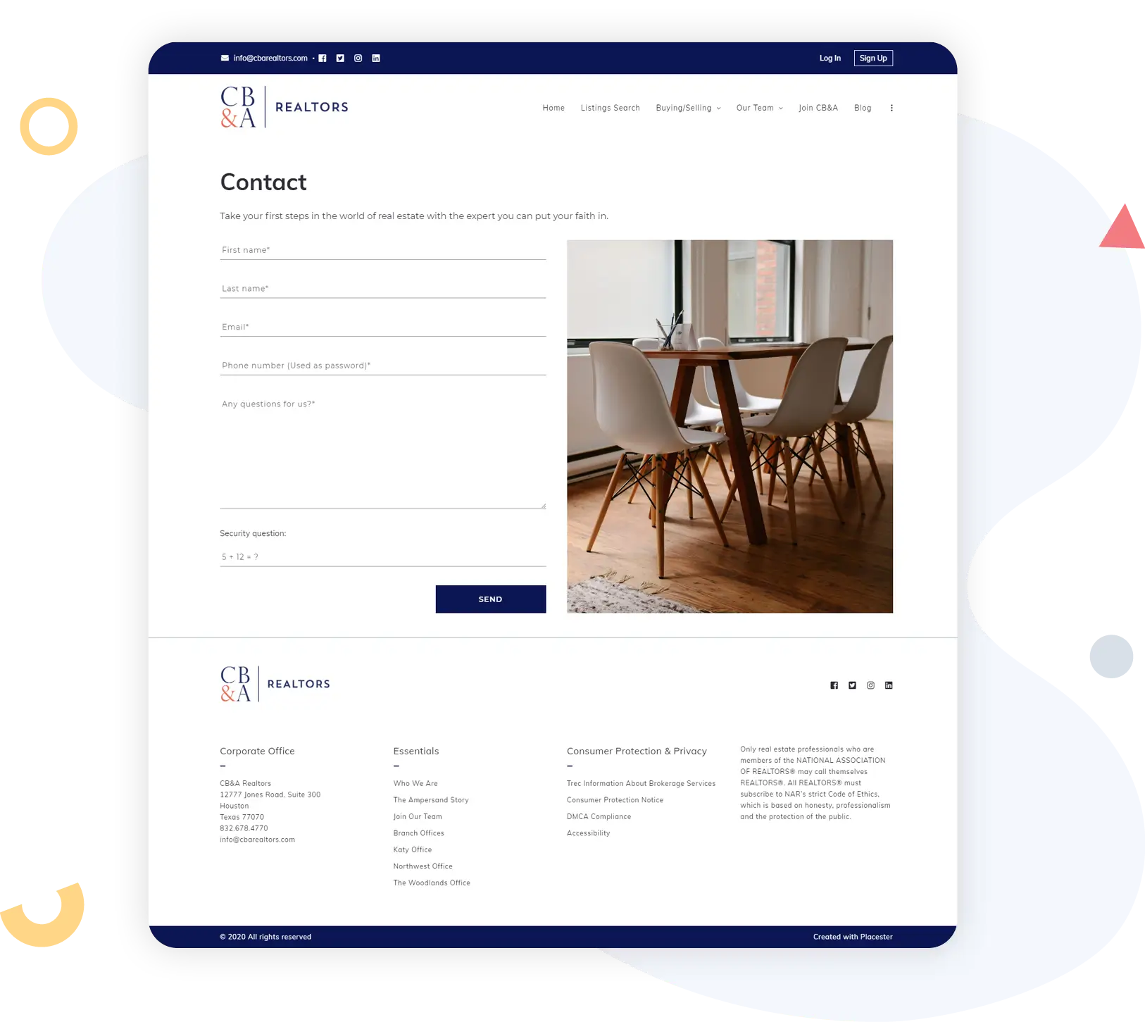
Brokerages with more than one office, like CB&A Realtors, might include contact information in both the page header and footer, as well as provide a full page with details for each office.
Social media links
Depending on how active you are on social media, you might also want to include links to your social media profiles so that your leads can explore them and get a better sense of how you operate, where you work, and anything else you want to share on those platforms.
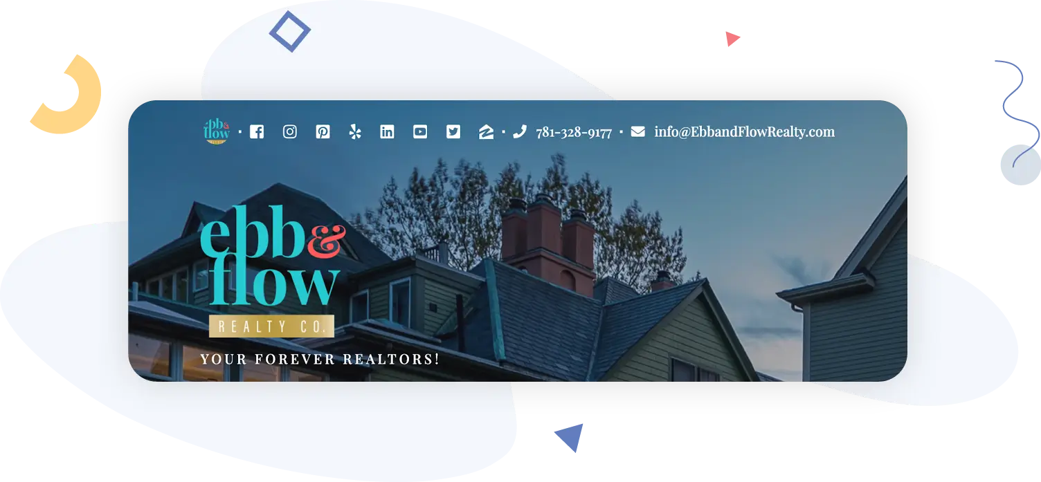
This is easy to do in most websites today. On Ebb & Flow Realty Co., you’ll find social icons beautifully displaying within their header information.
Landing pages
A landing page can also be thought of as a “destination page”–it’s the page on your website where you want to direct visitors for a specific marketing campaign. For example, let’s say you’re running a Facebook ad campaign promoting one of your listings. The landing page would most likely be either the listing’s page on your website or a lead capture form, or some combination of the two.
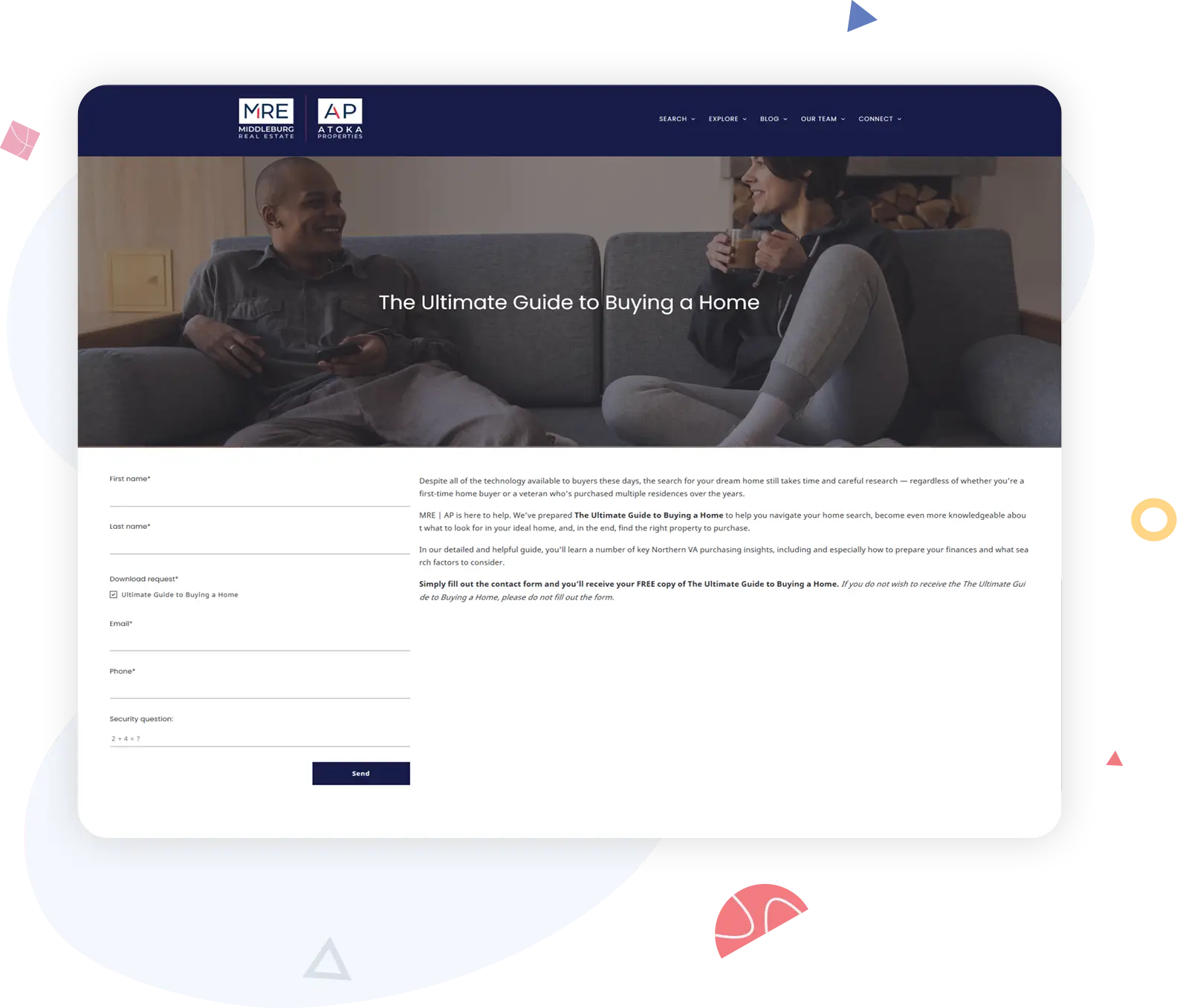
This Ultimate Guide to Buying a Home landing page created by Atoka Properties perfectly displays providing a free resource guide in exchange for the website visitors contact information. Once the form on this page is submitted, they’ll immediately receive their resource guide.
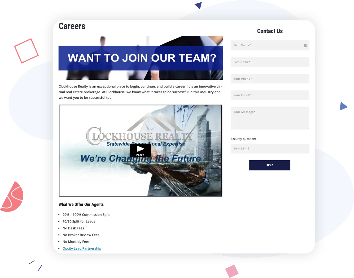
An interesting example of a landing page is this Careers page created by Clockhouse Realty. In an attempt to upgrade their agent recruiting efforts, Clockhouse identifies what they offer to those in the industry and they make it easy to reach out via a contact form.
Lead capture
Most landing pages include some form of lead capture, but landing pages aren’t the only place you’ll want to put a lead-capture element on your website.
The Buy Sell Love Chicago team uses an elegant and simple lead capture form on the home page.
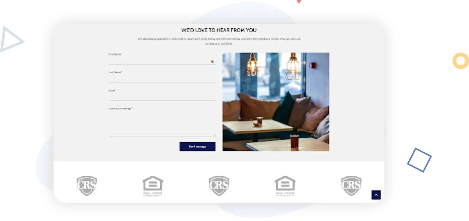
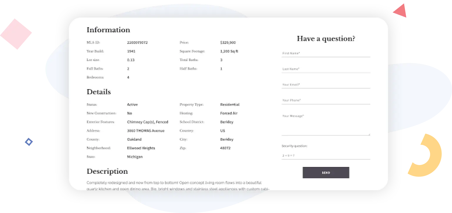
Many of the best real estate websites also include static lead capture forms that appear on every page in addition to your contact information. Here’s an example from Cooper Glass Homes; an identical lead capture form is embedded on many pages across the website.
CRM integration
Capturing a lead is only worthwhile if you have a plan for how to nurture that lead. A customer relationship manager (CRM) platform is how real estate agents keep track of their leads, categorize (or segment) them into buyers and sellers, and note where the leads are in their own home purchase or sale journey.
Some agents try to do this with a spreadsheet, and that might work when you have a handful of leads, but if you hope to do any amount of steady business, a CRM is critical. Ideally, it will integrate directly into your website so that any lead information that you capture is funnelled into your CRM immediately.
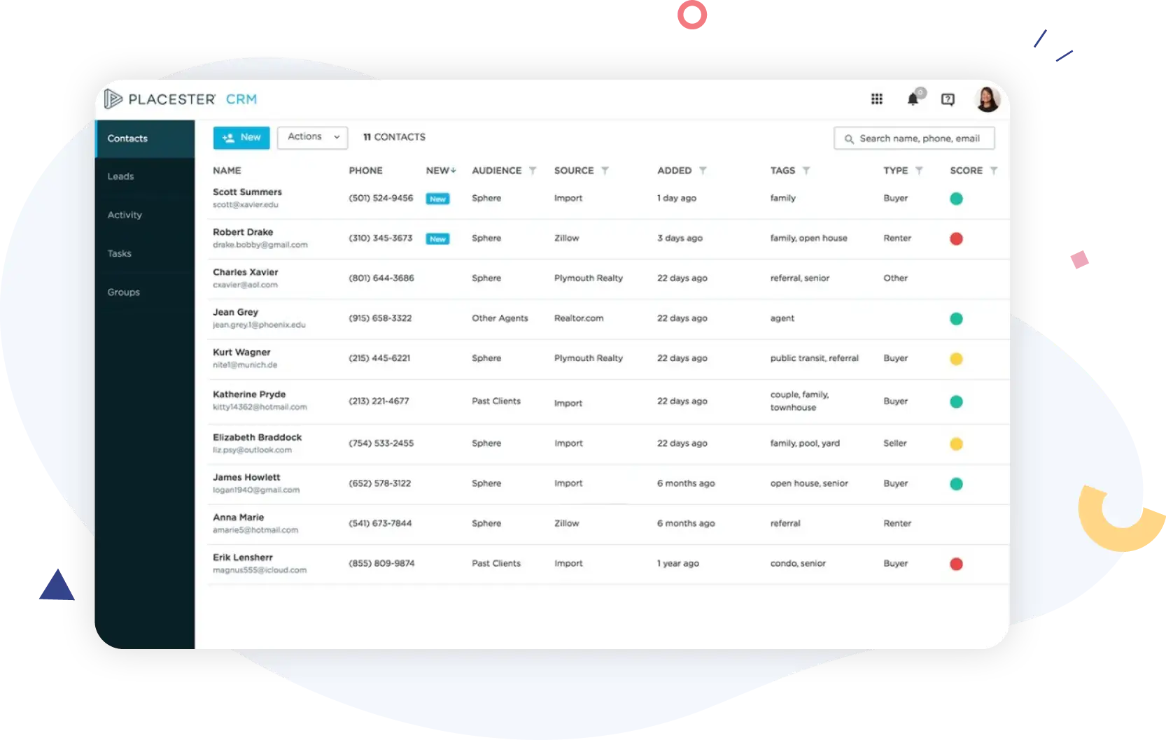
Once leads are in the system, you should segment them by demographic data and preferences (for example, do they have a family, what age group are they in, do they prefer a condo or a single-family home), all the way down to the lead source. This allows you to personalize and tailor your communications for every lead so that you can deliver the information that’s most timely and relevant for them£proving your worth as a real estate resource.
Choosing A Design That Resonates
Real estate is a highly visual industry. You’ll want your website to be easy to navigate and use so that it satisfies visitors, and you’ll also want to consider imagery and how it all fits together.
High-quality, local images
Your website is a chance to show both buyers and sellers that you understand the community where you work and the people who live there. One of the best ways to do that without saying a word is to use high-quality images that prove you’re a local.
You’ll probably find that it’s well worth it to hire a photographer to take some of those images because paying for pictures piecemeal can get expensive. If you do live in an area with enough quality fair-use images to get by, make sure you’re crediting those fair-use photographers!
Even if you decide to go with less locally focused real estate images while you’re getting your website off the ground, make sure that they are (at least) very high-quality. As smartphone, tablet, and computer screens improve, the images on them need to be better. Don’t use pixelated or grainy photos; there’s no excuse for it in this day and age. Laurie Weston Davis has an excellent handle on images that support her niche in the Village of Pinehurst and downtown Southern Pines, North Carolina.
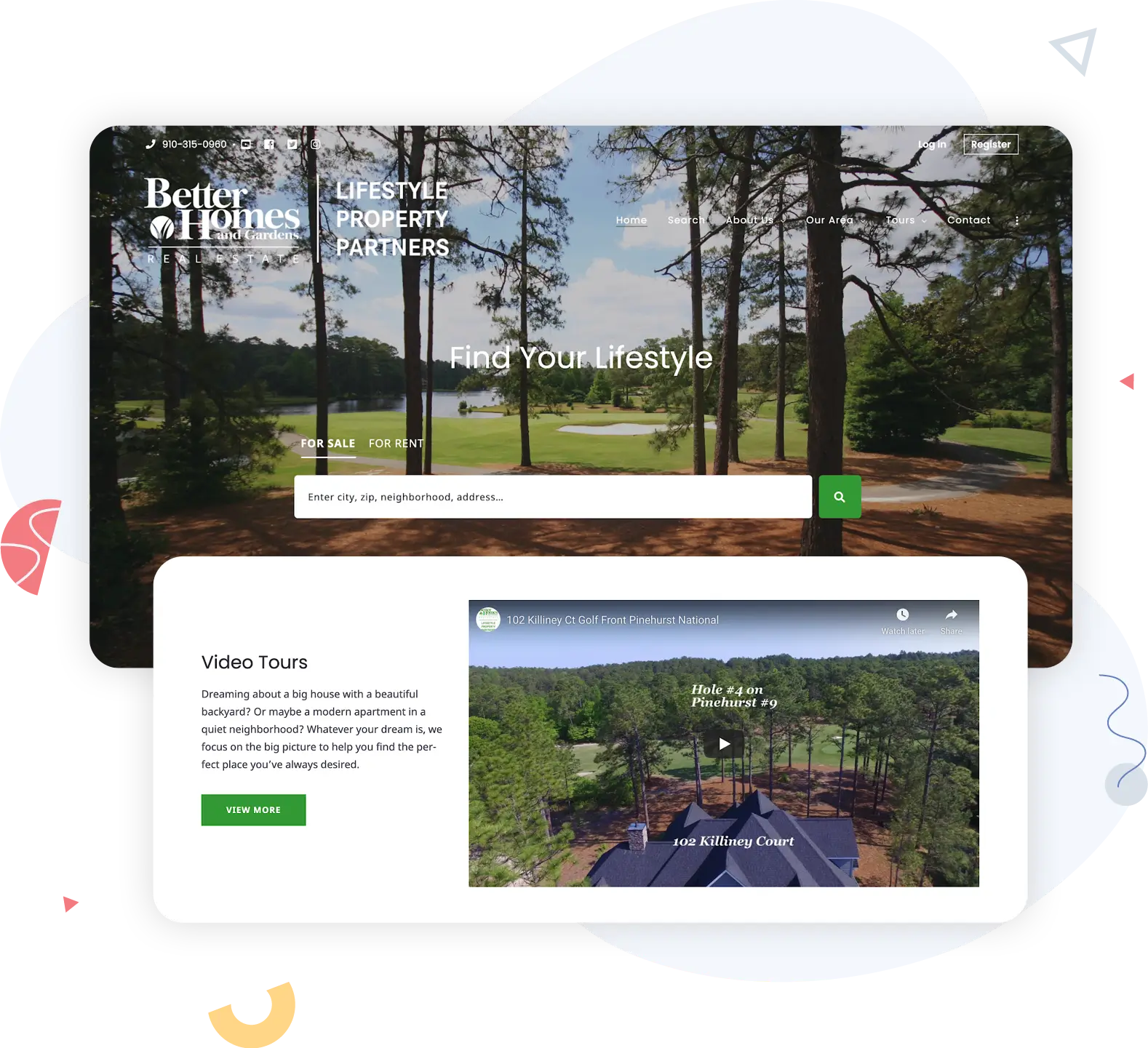
The photos on her home page are high-quality, clearly showing the area of Pinehurtst where Weston Davis helps people buy and sell homes. The colors in the images complement each other without being matchy-matchy, including the rotating carousel of images at the top of the page. And all of the images are tasteful and evoke affluence and a specific North Carolina lifestyle that speaks to the buyers and sellers who love Pinehurst. The carousel of hero images on the Cape House Team website is another example of high-quality, local images applied to real estate.
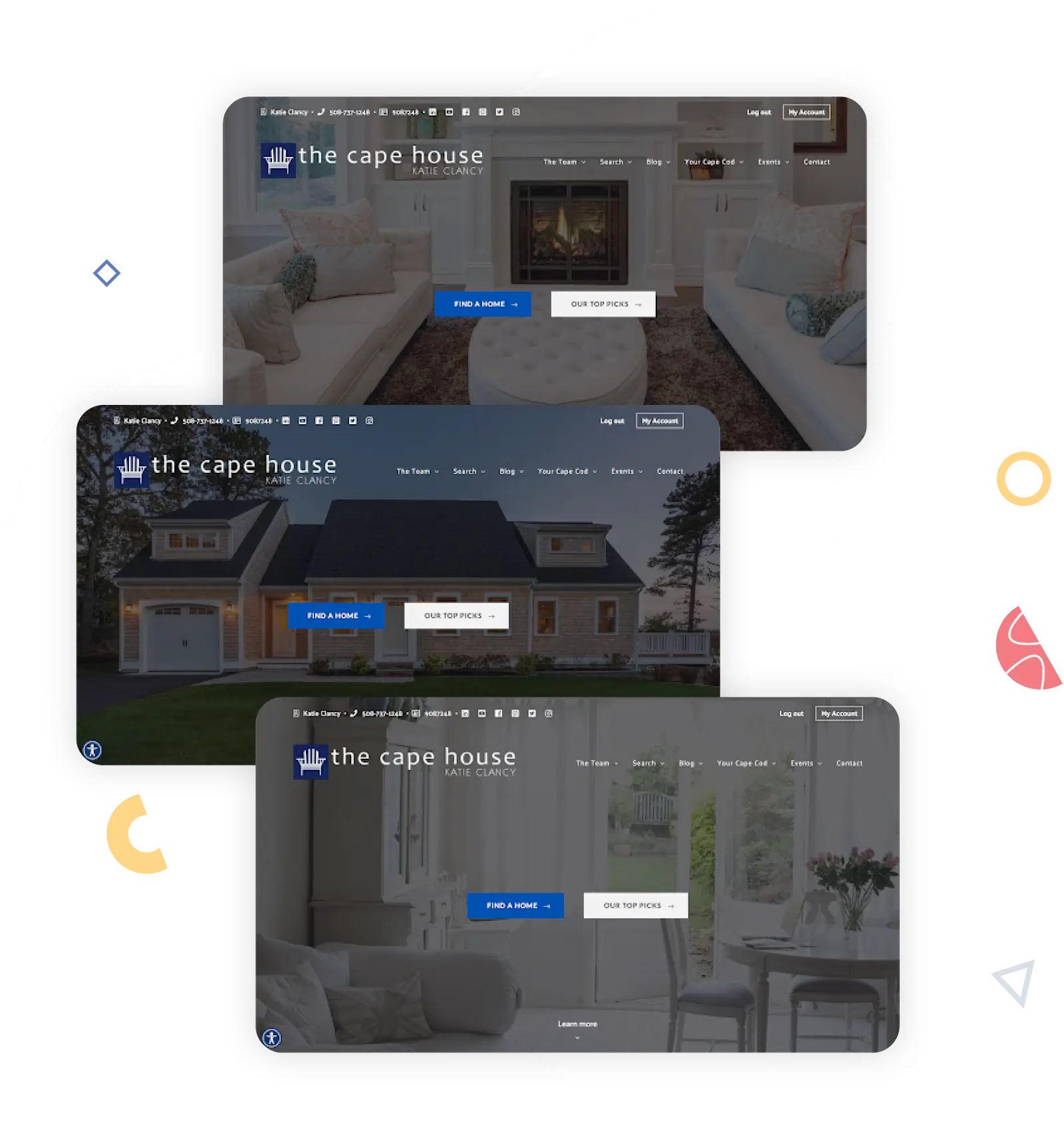
Like Laurie Weston Davis’ website, the photos that rotate across the top of the home page on the Cape House Team home page are also aspirational, featuring high-end homes and gorgeous views. The philosophy behind why you should include high-quality local images is the same across the real estate industry, but the execution will depend on your market and target audience.
Mobile-responsive design
It’s no secret that lots of people search the internet using their mobile devices, but in case you needed a reminder of just how important a mobile-responsive design really is: mobile has surpassed desktop for search engine market share, capturing 54.28% of market share in October 2021.

It’s critical that your website is mobile-responsive so that you can provide a good experience for the people who find you on a mobile or tablet device. Let’s revisit a couple of websites we’ve already seen on a desktop arrangement.
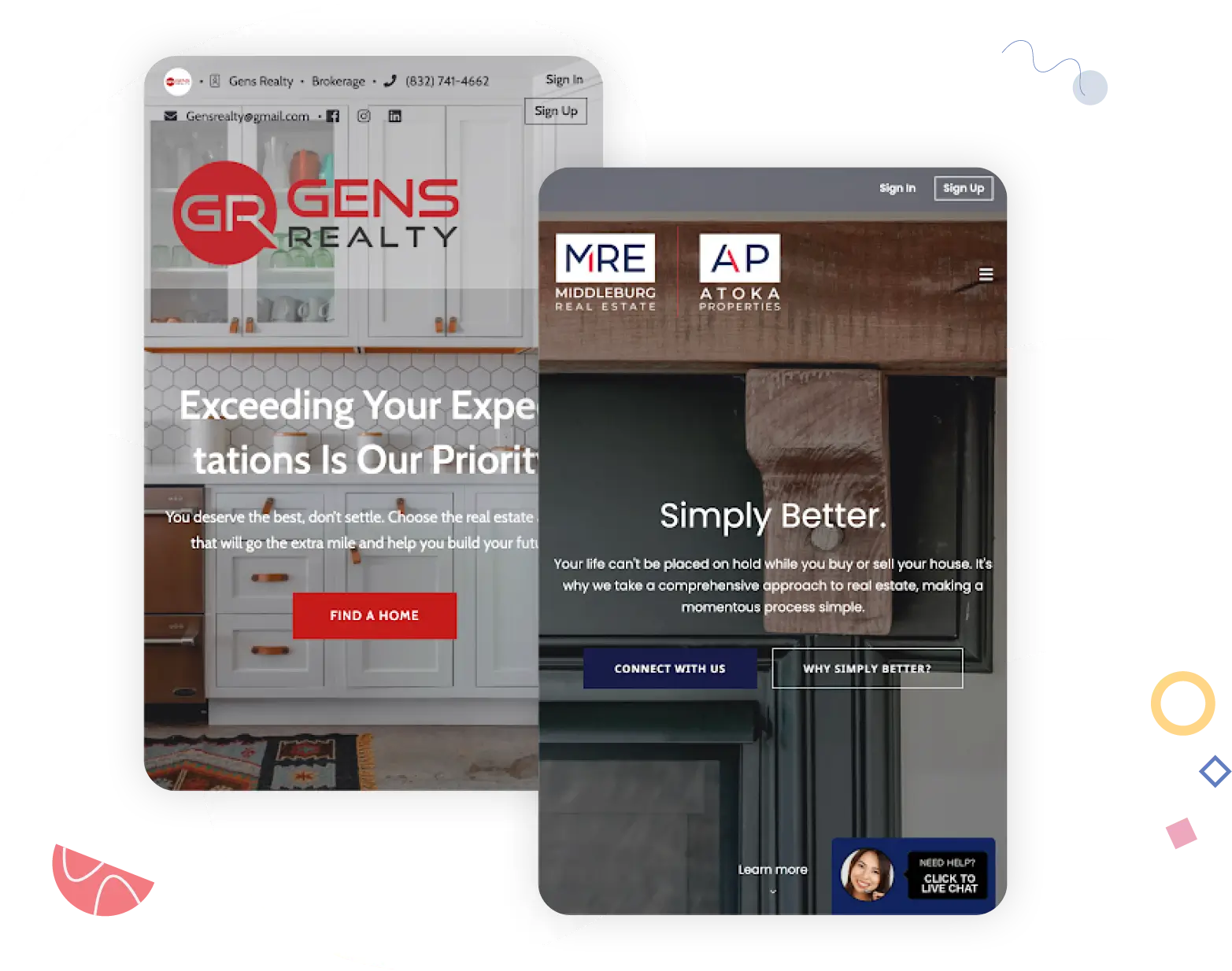
Both the GENS Realty and Atoka Properties websites load quickly on a mobile device, and all of the same elements are there£just rearranged and optimized for a different screen size and shape. You’ll want to make sure that your website is similarly responsive.
Search Options: Ways To Share Homes For Sale
Who’s interested in looking at homes for sale? Maybe a better question is, who isn’t interested? Buyers have an obvious stake in seeing what’s on the market because they might end up living there one day, and sellers want to check out the competition, but many existing homeowners or renters with no intention of buying can’t resist browsing through open listings and homes under contract just to see what’s out there.
Naturally, a lot of that search traffic gets swallowed up by the real estate portals, but you should still think about offering one (or several) home search components to your website.
IDX search
An IDX (internet data exchange) search is the best way to ensure that visitors can browse listings directly from the MLS, providing the most accurate and current listings available. Your IDX is the link between your website and the MLS. Adding IDX to your website might be quite easy if you’re using a website platform that was built for real estate agents, or it might require buying a plugin or playing with code if you’re using something that’s not real-estate-specific. Some features to look for in your IDX solution include:
- Full MLS coverage
- Complete and accurate property data feeds
- Frequently updated listing data
- A mobile-friendly interface
- Search-engine-optimized architecture (so buyers searching Google have a shot at seeing the listing on your website)
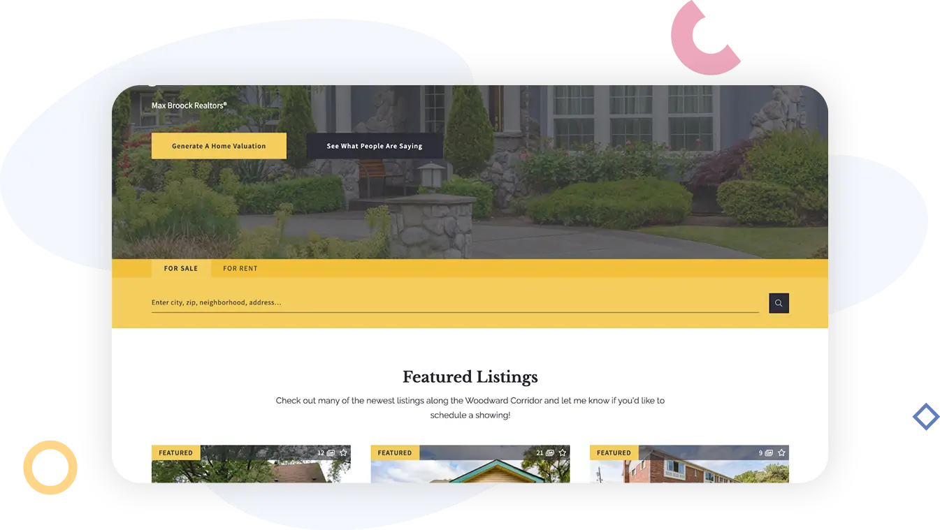
For more information on IDX feeds and tips on choosing a solution for your website, read our Academy post: What Is IDX? An Explanation for Beginner Real Estate Agents. Many real estate websites make IDX search a key feature near the top of the home page, such as Josh Gold.
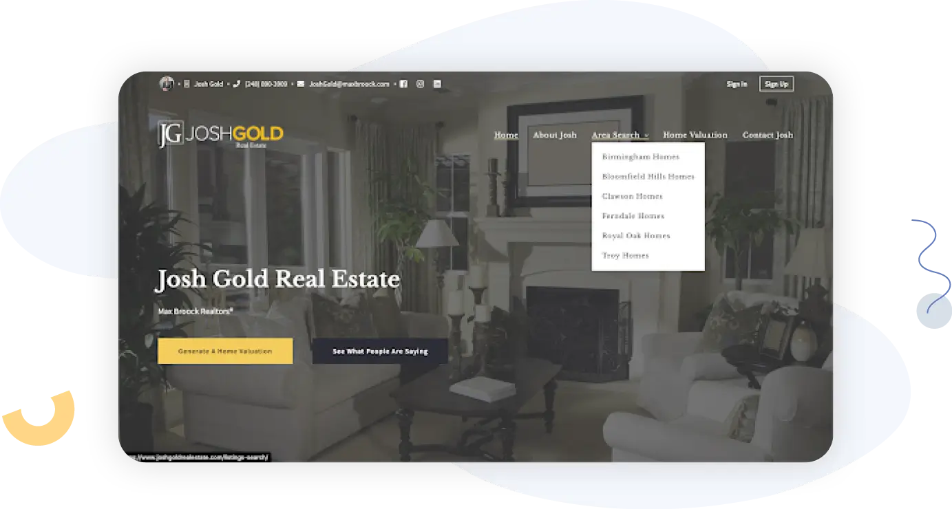
He also has multiple area search pages a listing search page (linked in the navigation bar) where visitors can browse Metro Detroit homes for sale.
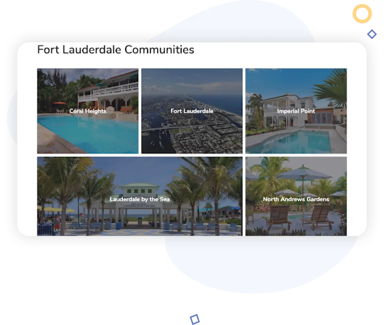
Depending on your market and niche, you can get mildly to moderately creative about how you organize and display listings on your website, too. Fort Lauderdale agent Tom Wolf also uses a hero display with IDX search displayed front-and-center, but check out the array of options that visitors have for parsing their Fort Lauderdale home search.
Wolf provides a separate IDX search experience for browsers interested in:
- His active listings
- Specific Fort Lauderdale communities
- New contruction
- Waterfront homes
Or, browsers can choose from specific Fort Lauderdale communities using an area index search page.
Featured listings
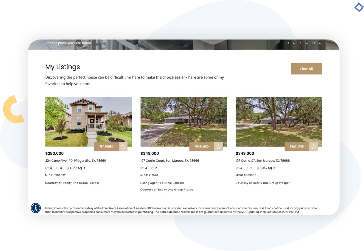
The listings you feature might be your own, or they might be noteworthy listings (for a historic home, perhaps) that belong to other agents. It’s up to you and your business goals; know that adding featured listings gives you the opportunity to drive more views or traffic to specific homes (which means that they should probably be at least a little bit special in some way). Realty One Group shows featured listings on its home page “below the fold” (you have to scroll down to see it).
Note the stars on the listing photos so that logged-in browsers can “favorite” a property.
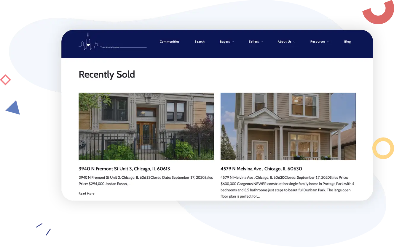
Recent sales
Both buyers and sellers are interested in seeing recent sales, so including an area of your website where visitors can browse or search recent sales can be a good way to drive traffic. Buy Sell Love Chicago does exactly this on a page just for recent sales.
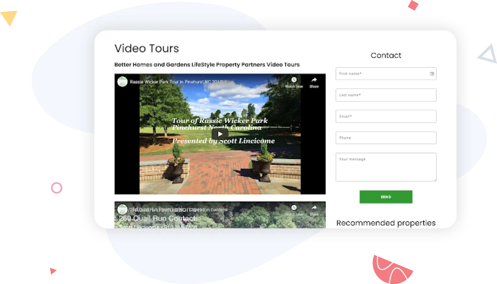
Photos of homes for sale are ubiquitous, but buyers who crave videos can’t always find them (especially buyers searching for specific types of homes in targeted areas). Agents can provide listing videos on their website for buyers to browse, which helps them eliminate homes that clearly won’t work, saving everybody time.
Laurie Weston Davis has a vlog where she embeds YouTube listing videos, for example.
3-D tours
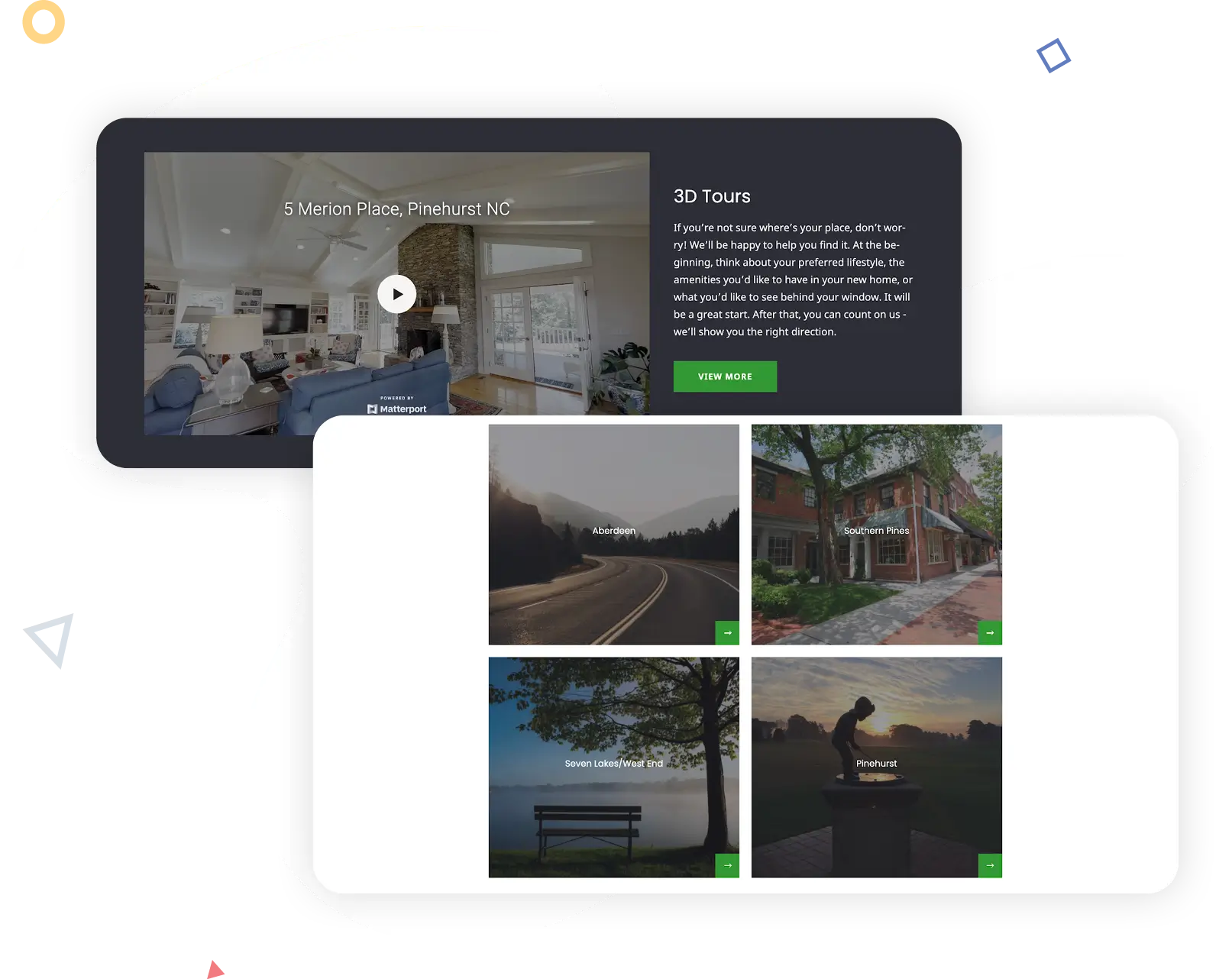
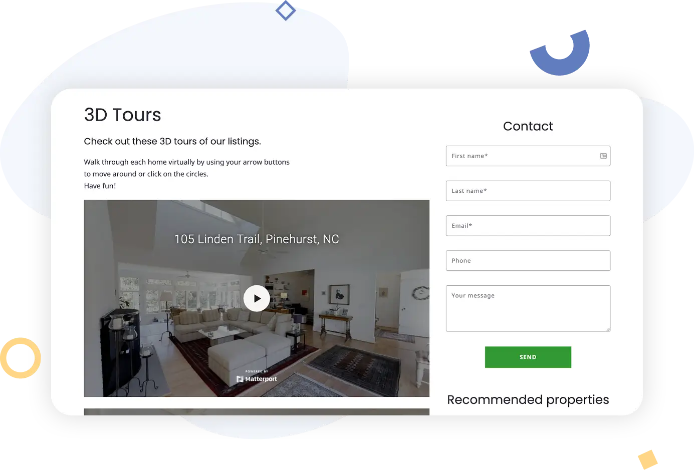
Even more immersive than videos, 3-D tours are shot using a special camera and then embedded into your website or linked on a separate page for a fabulous buyer experience. (Sellers love this form of marketing, too; it feels very 21st-century.) The most popular and widely supported product for creating real estate 3-D tours is Matterport.
Again, Laurie Weston Davis and the Lifestyle Property Partners website uses the embedded-in-page option for the 3-D tour page.
About You And Your Business
Now that you’ve set up a way to capture leads on your website, and a way for visitors to browse homes for sale, it’s time to figure out what you want to tell your audience about yourself and your business.
This is a personal choice; some agents like to include a lot of details, while others prefer to stick to just the contact information in the page header, footer, or both. You’ll want to decide which components to include depending on your resources – for example, if you have several glowing reviews from buyers or sellers, then you’ll probably want to think about including reviews on your website.
About information
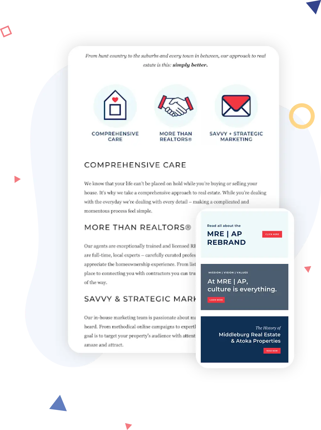
Real estate agents can use the “about” section on the page to share their sales philosophy, their personal connection with homebuyers or sellers, or anything else that might resonate with a lead. Atoka Properties uses the “about” page, or “Who We Are” in the navigation bar, both to appeal to leads and also as a recruiting tool. Toward the top of the page, the brokerage’s “bio,” so to speak, explains its niche (“hunt country” and suburbs in the Virginia- and West Virginia-based D.C. metro area), then describes some of the things that set the brokerage apart from the competition.
Further down the page, the brokerage offers more details about a prominent rebrand and what it means, plus the company’s culture and history. These extra details can be interesting to some buyers and sellers, but where they really shine is to help attract high-quality agents to the brokerage. Agents can start to get a sense of the brokerage’s specialty and whether they’d fit in without having to interview, which saves everybody time and is especially appealing to the agents who would fit in well.
Reviews
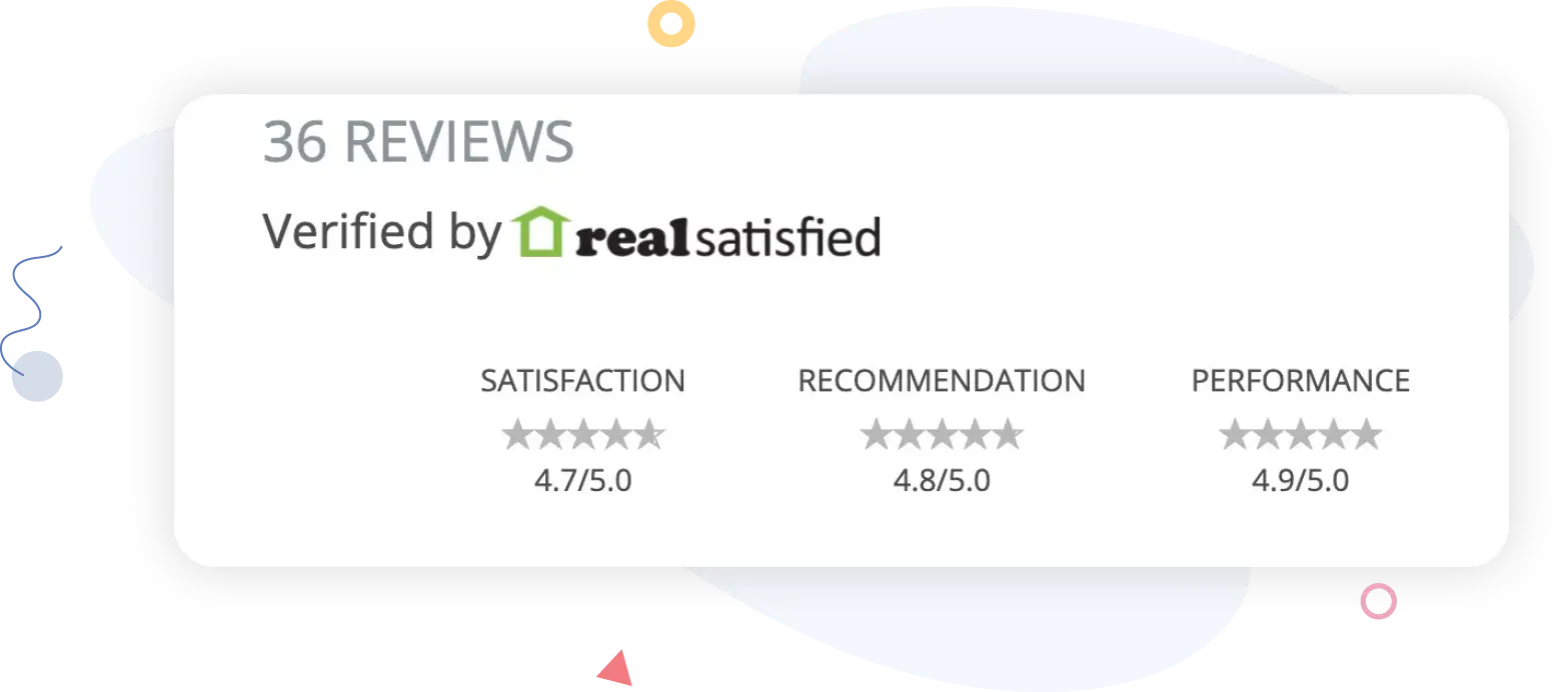
Reviews are one of those website components (and business components in general) that can be very easy to ignore in pursuit of other objectives–but we’ll be the first to tell you that in this day and age, that might be a big mistake. According to research by BrightLocal, 82% of consumers read online reviews for local businesses (that would be you), and the average consumer has to read 10 reviews online before they trust a business. Plus, only 53% of consumers would consider using a business that has less than a four-star rating. We could keep going, but hopefully you get the point: Reviews can make a big difference in how much your leads trust you before they even meet you. And when it comes to displaying them or promoting them on your website, you have options. Lowell Lofts broker John Callahan has a separate page on his website that’s populated with reviews. It includes aggregate information from RealSatisfied so that his visitors can see his average ratings.
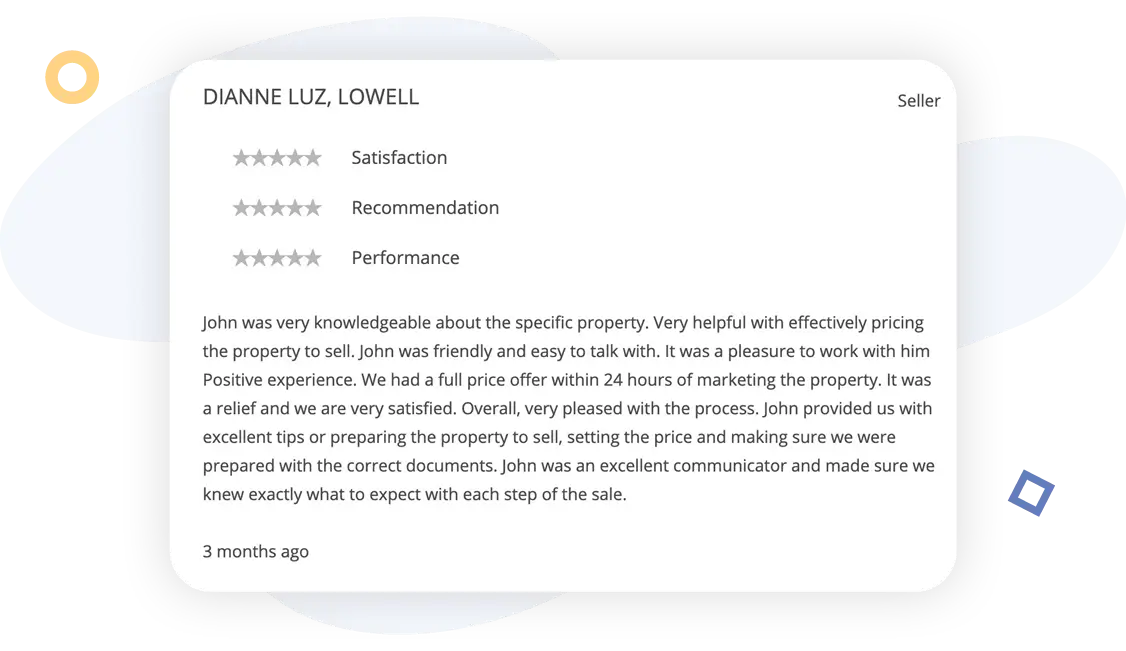
Visitors can also read individual reviews from Callahan’s former clients, as well as see when the review was written and the overall ratings that the client gave him.
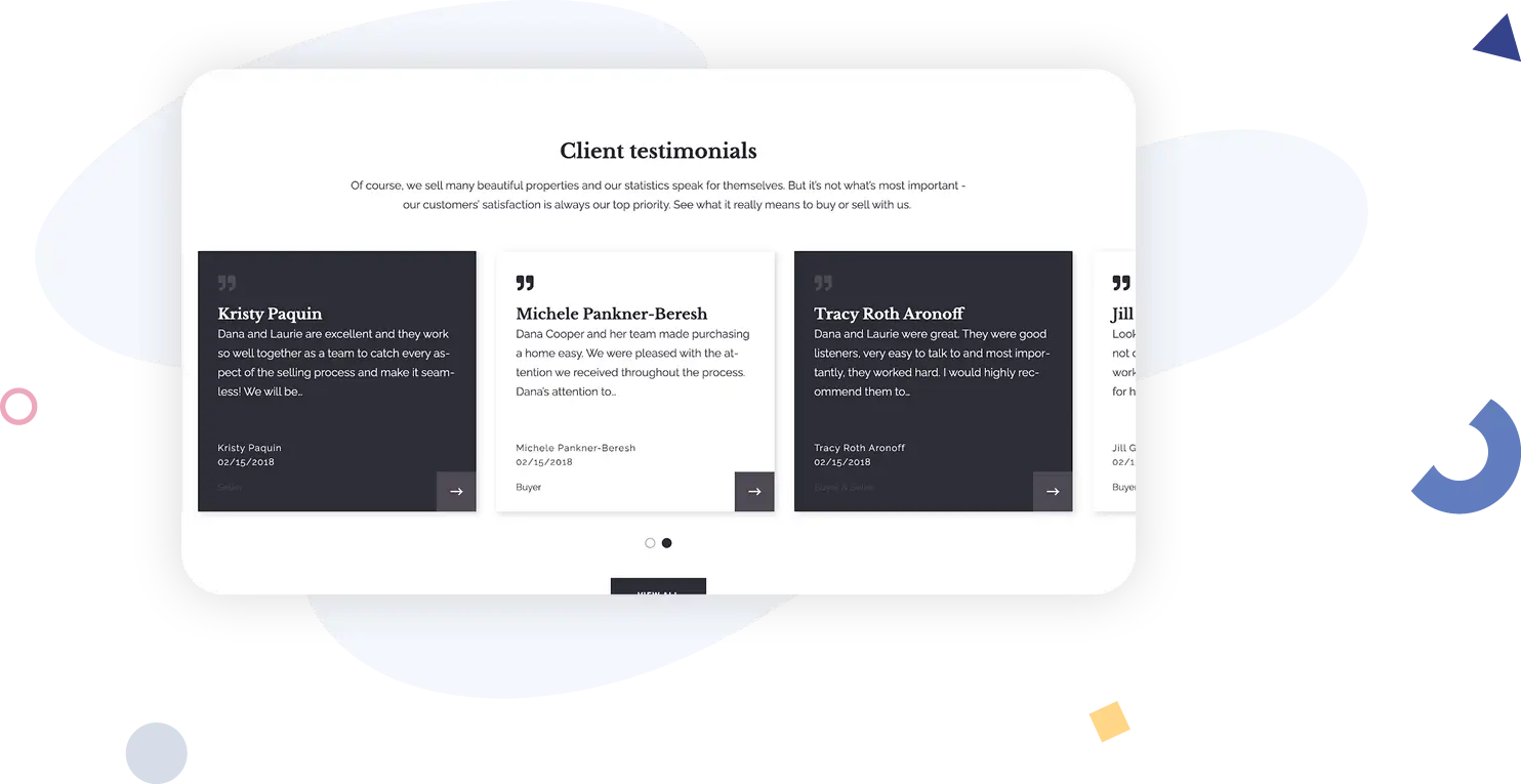
Other agents might decide to display reviews on their websites as a home page component in addition to hosting a separate reviews or testimonials page. That’s how Cooper Glass Homes has chosen to tackle it; the home page testimonials are displayed with side-scrolling functionality so that visitors can “flip” through a few top reviews on the home page before deciding whether or not to click through and read more.
Pop-up sign-up form
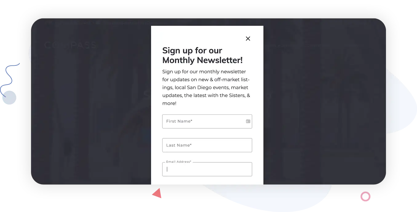
A type of lead capture form, these pages are ideal for agents with ongoing assets or resources to share with buyers or sellers, such as a market newsletter, regular infographics or data dumps, mortgage news, seasonal tips–whatever you’re using to keep your leads engaged. The Sisters Sell San Diego website has a pop-up form that offers new and off-market listings, local events, market updates, and more. It’s specific about exactly what visitors will get and how often they’ll get it.
Details about how you market properties
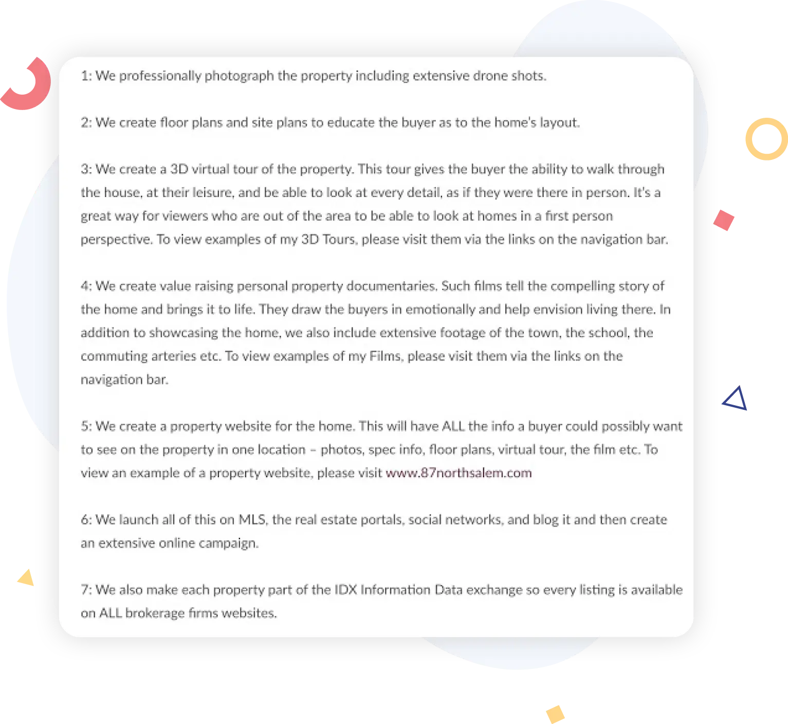
Sellers can be understandably nervous about choosing a real estate agent because they want to know that you will do your best to expose their home to the largest possible pool of buyers, so that they can get the best possible offer. Marketing is a critical component of that exposure, and agents who offer details upfront about what they do to market a home can help ease a seller’s mind (and dial down the listing-appointment intensity at least a notch or two).
On her website, Deb Camuso has written up a section clearly outlining how she markets listings.
Special programs
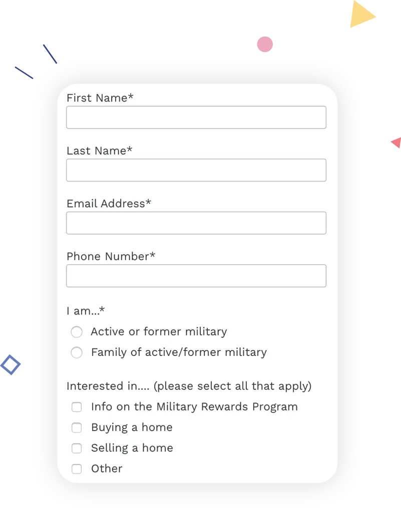
If you go to the trouble to offer special programs or work with specific types of buyers and sellers, a good place to share more about it is on your website! You can create landing pages and campaigns to attract those buyers and sellers, specialized lead capture forms that share more details about those leads, and other targeted tactics that can answer questions and put your future clients at ease.

Coldwell Banker Success offers a military rewards program that gives eligible buyers between $350 and $7,500 as a cash-back at closing. On the page where it sketches out the program, the brokerage also invites leads to learn more and indicate whether they are active or former military, and whether they’re interested in buying or selling.
FAQs
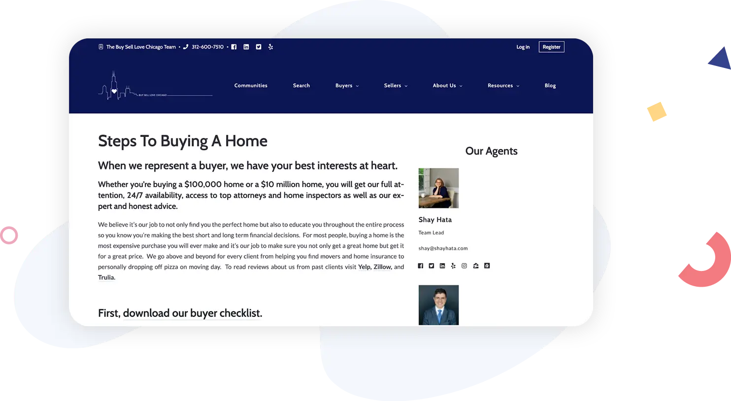
Buyers and sellers (and homeowners, for that matter) all have a ton of questions about the process, commission rates, inspections, appraisals, affordability–you name it. Those questions vary by market and according to niche. Start with the most basic questions that you hear the most frequently from both buyers and sellers. Just posting a handful of frequently asked questions on your website can save you a ton of time over the years as buyers or sellers stumble across those answers before they ever have to ask you about it. Buy Sell Love Chicago shows what a real estate buying FAQ page might look like in practice.
Resources For Your Prospects And Leads
If the website basics, home search, and business information represent the skeleton and vital organs of your website organism, then the resources you provide for your prospects, leads, and current clients are the musculature that power it. In which direction will it take your business, and how quickly? That really depends on what kind of content and assets you’re offering buyers, sellers, and homeowners.
Some agents don’t bother much with resources, and that’s okay! Providing high-quality resources that will drive leads and business can be quite time-consuming, and not every agent wants to prioritize it. But remember the analogy, because strategically adding a muscle or two to your website can produce remarkable results.
High-quality local content
The best way to show that you understand your market, the people who live there, and the people who want to live there is to provide them with high-quality information about the area. After all, you’re immersed in the community; you probably know it better than just about anybody, so sharing some of that knowledge can help create connections.
It doesn’t have to be all real estate-focused, either. Understanding the lifestyles and types of people who live in your area and who are interested in buying and selling, and then catering to those lifestyles, can also take you pretty far.
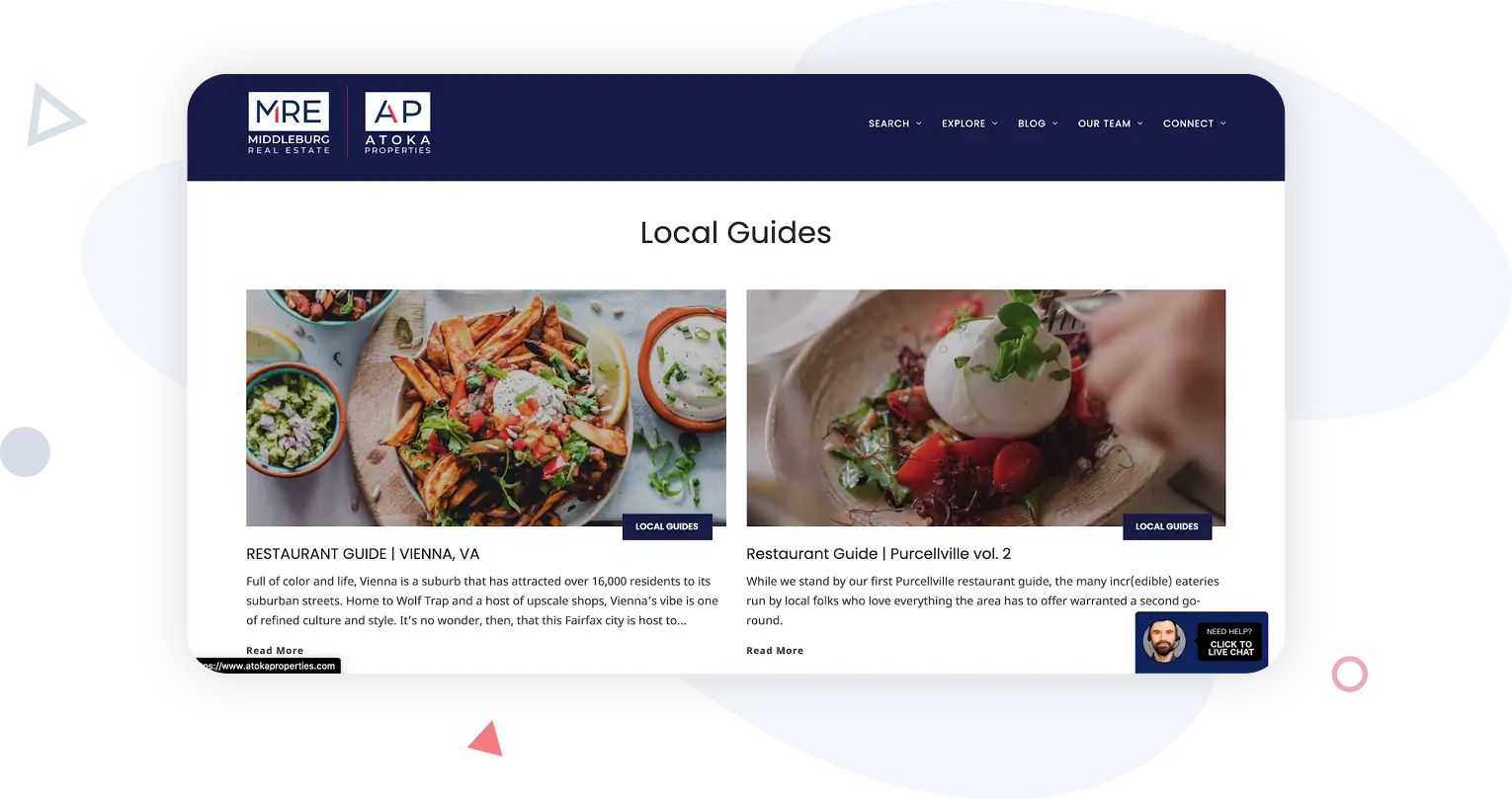
Atoka Properties blog about Northern Virginia has some real estate-related posts, including market predictions, but it also offers local guides and interesting area-specific content to engage their visitors.
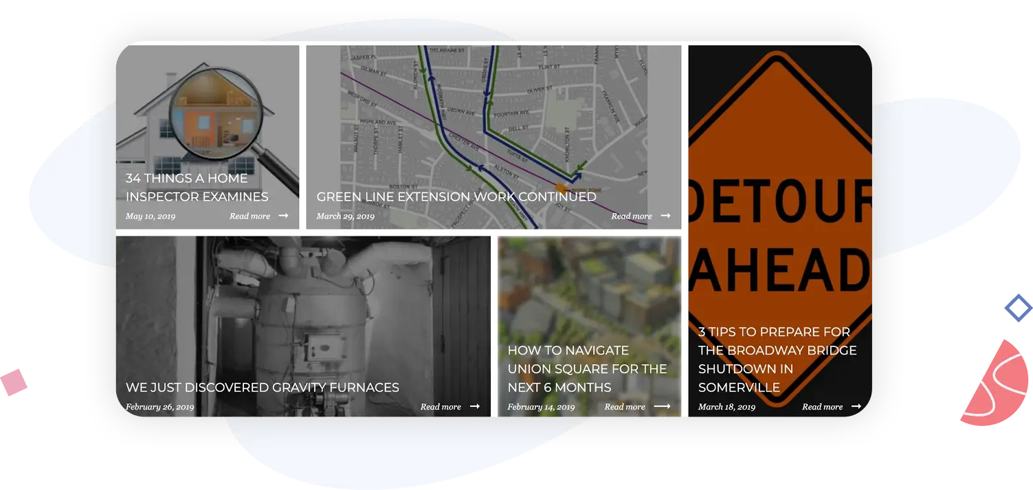
The Branch Out Residential Team blog also does a good job of showing that these real estate agents understand the area and what residents want (or need) to know–from traffic updates to home inspection details to a delightful post about gravity furnaces.
Community pages/guides
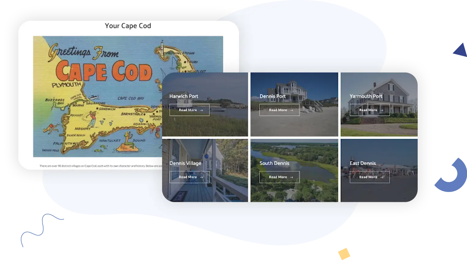
Because you work with homes and people in your area, you probably understand the differences between one neighborhood and the next (and one street and the next) better than just about anybody around, and that’s information that buyers especially crave–but sellers find it valuable, too. A community page or neighborhood guide is an attempt to share that information with your clients. This gives your leads an idea of how capable you are and how well you understand the lifestyles and attractions in different neighborhoods, and it also helps you promote areas and neighborhoods that don’t get enough attention to buyers who might otherwise remain oblivious. Katie Clancy’s community guide visually displays the 90+ distinct villages on Cape Cod! Just below that image, she makes it easy for visitors to search active listings in many of these areas.
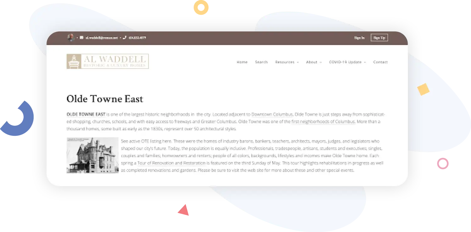
Al Waddell shares information on his website about historic Columbus, Ohio, neighborhoods. In the Olde Towne East description, he touches on the area’s history, of course, but also shares details about an annual renovation and restoration tour.
High-quality niche content
This is content that specifically pertains to the type of buyer or seller you like to target, or perhaps your niche in terms of the types of homes you generally help people buy or sell. Yes, this is a little bit different than local content, community pages, or buyer-specific or seller-specific resources.
Audience-specific resources
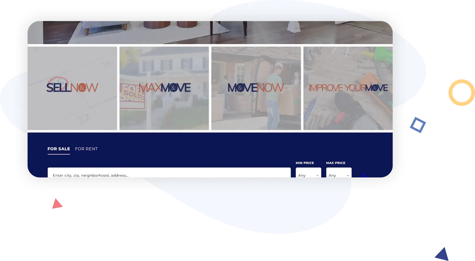
Buyers and sellers obviously want different things out of the real estate transaction, and agents who cater to investors have yet another type of client and potential audience to add to the mix. In order to deliver different resources to those different types of leads, many agents create separate pages on their websites for buyers and sellers (and investors, if applicable). That’s what CB&A Realtors does they provide a homepage breakdown of each unique offering that they make available to visitors looking for buyer, seller, and home improvement resources.
Property management
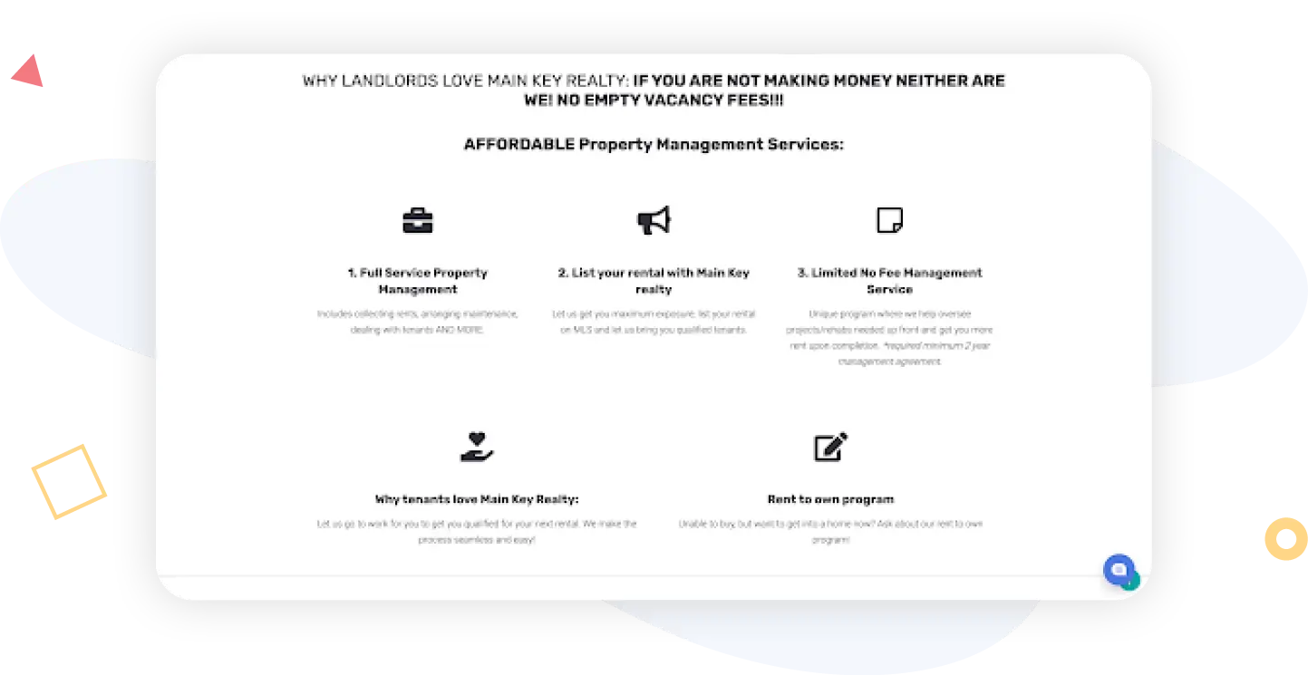
Homeowners interested in buying a second home and renting out the first, out-of-state buyers hoping to score an Airbnb investment home, or sellers who are having a hard time getting a good offer for their house–all of those groups are candidates for learning more about property management. If this is a service that you or your brokerage offers, you should definitely tell visitors about it on your website. Most people don’t grow up wishing and hoping to be a landlord, and if they can delegate the responsibilities for a reasonable fee, they will likely be more than willing to at least discuss it. The property management page at Main Key Realty gives a solid overview of the property management services that Main Key provides.
Calculators
Math is hard, and there is a lot of it involved in a real estate transaction. Buyers want to know how much they can afford to spend without going broke; sellers want to know how much they can reasonably expect to get for their house. Providing a home valuation for sellers (or buyers who want to price a house that looks intriguing) can be a good way for real estate agents to capture lead information. The Southeast Alaska Real Estate team does an excellent job of directing traffic to a home valuation landing page to accomplish this.

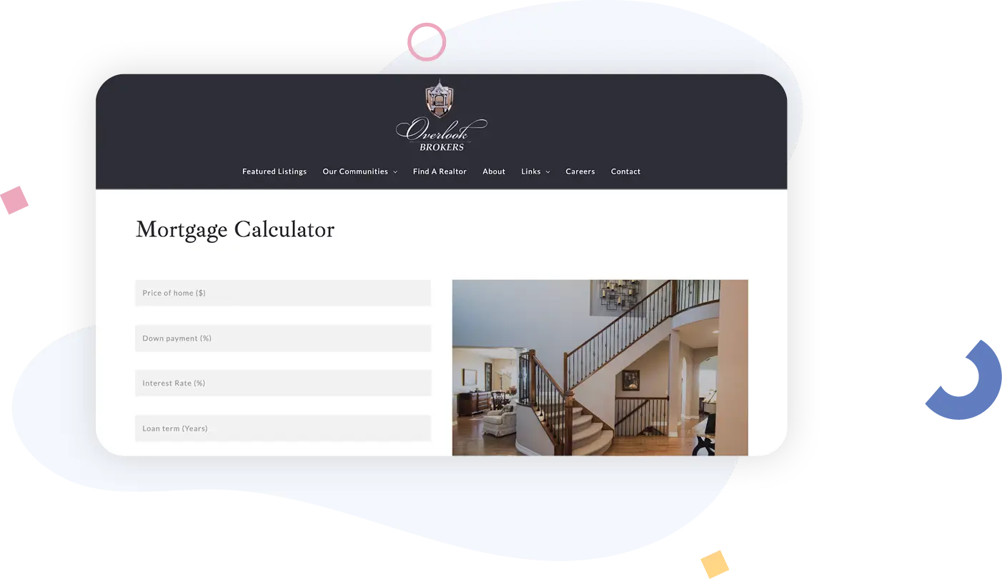
Overlook Brokers offers a mortgage calculator for buyers on a unique landing page embedded at the bottom of her website pages that lets them enter price, interest rate, loan term, and down payment percentage to give buyers a rough idea of what they’ll have to pay every month.
Downloadable assets
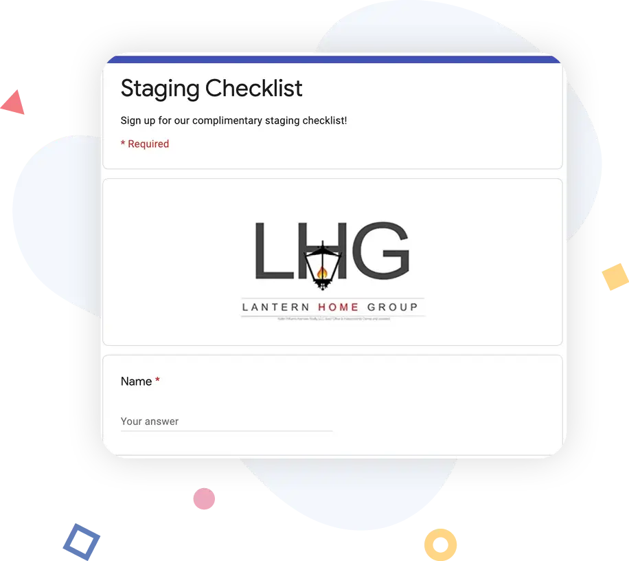
A downloadable asset is something semi-tangible you can provide to your leads that helps to showcase how much you know about buying and selling real estate–and that is actually valuable to your lead. After all, if you’re freely giving away good information about how to buy or sell a house, your leads are going to feel like there must be a lot more where that came from. Lantern Home Group offers a staging checklist for sellers that’s linked in the navigation bar; it leads to a lead capture form where sellers can enter their information and get the checklist delivered via email.
Market reports
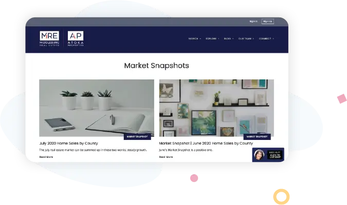
If you ask any real estate agent what question they hear more than any other, the odds are they’re going to tell you it’s “What’s the market like right now?” Answering that question thoroughly and thoughtfully can get you a long way toward winning over buyers and sellers, as well as current homeowners who are curious about how their biggest financial asset is appreciating. Atoka Properties has an area for market reports on their website that gets updated with recent information from the local MLS.
Pop-up live chat
One nice resource to offer website visitors is pop-up live chat in case they have immediate questions. Of course, “nice” can be in the eye of the beholder–we’ve probably all spent enough time on the internet to suppress a sigh when visiting a new website and getting visually bombarded with chat requests. Atoka Properties handles this elegantly by offering (not pushing) a live chat button in the lower right-hand corner, gently inviting browsers to click if they would like to chat.

Recommendations
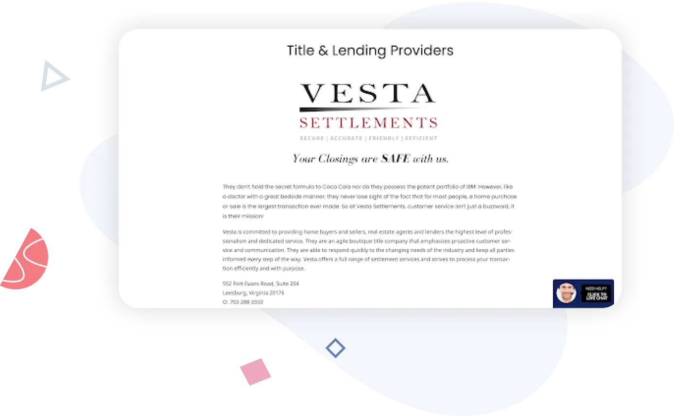
Your clients want to make sure they’re working with the best people, and you can help by sharing your expertise and connections. One helpful way to do this on your website is to share a recommendations page with resources for buyers, sellers, and homeowners. The Title & Lending Providers page on the Atoka Properties website includes recommendations for some of the best title or mortgage lending companies in their area. All of the recommendations on this page include a hyperlink to the company website and additional details to help make an educated decision.
Videos
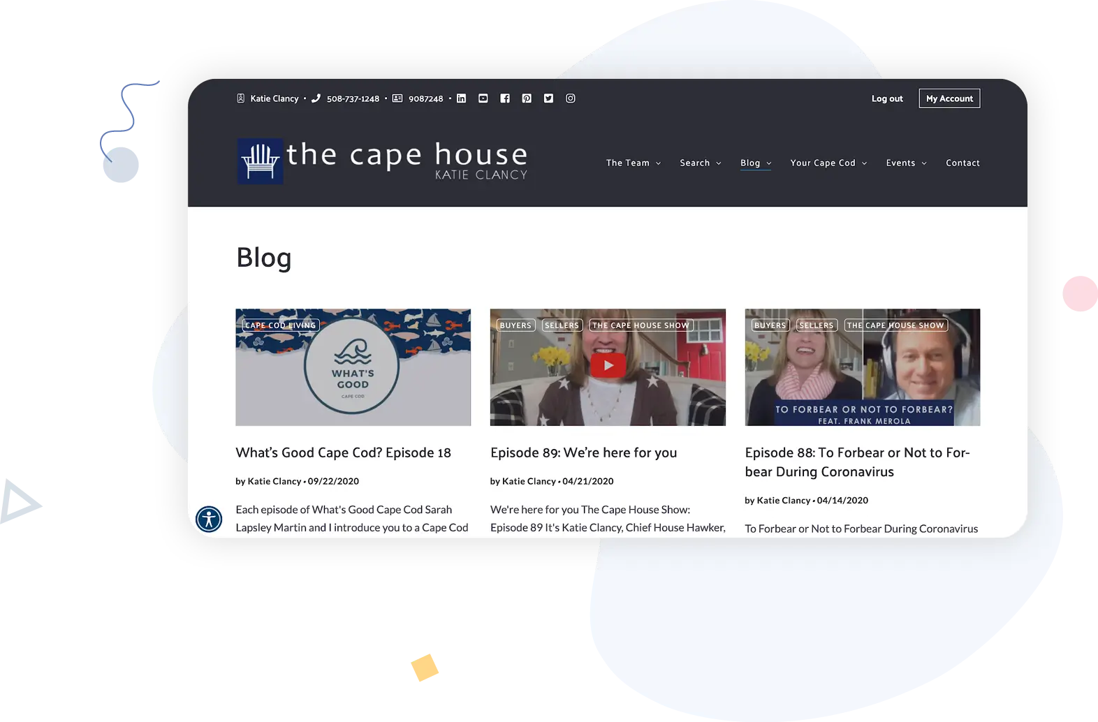
Didn’t we already cover videos when we talked about listings? No! There’s a lot more that real estate agents can do with videos to educate and entertain website visitors, capture an audience, and make a connection with future clients before you ever meet them. The Cape House Team has a video series called The Cape House Show, where Katie Clancy and her team talk about current events, community news, and real estate. Not only is there a YouTube channel, there’s also a separate area for Cape House Show videos on the website.
Finishing Touches That Leave A Good Impression
In other words, these are things that many people won’t notice if you don’t do them–but they make your website look pretty sharp and like you made some extra effort when you do!
Favicons
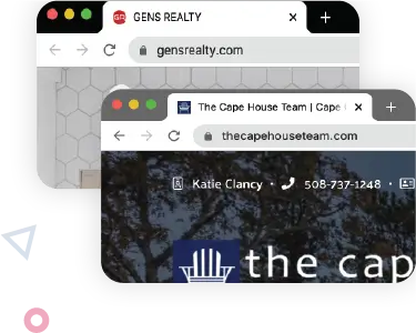
A favicon is the itty-bitty little icon that shows up in a browser tab when you’re not currently on the page; it shows you how to get back to a page easily if you have several (or several dozen) browser tabs open at once. (It’s okay; we do it, too.) A good favicon will be recognizable as your brand or business, but not overly busy or difficult to decipher. Here are three favicons that we like a lot. The GENS Realty favicon simply but clearly evokes the company’s brand. And seriously: How cute is the Cape House Team’s favicon?! A good designer can give you a favicon version of your own company logo that’s equally appropriate (and adorable).
Timely resources
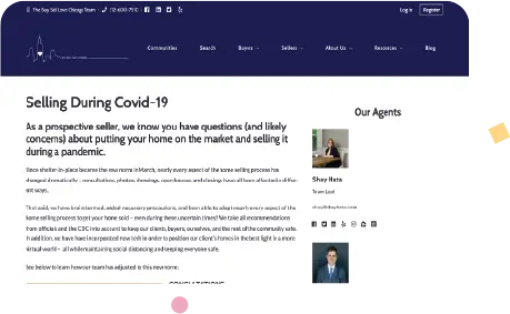
Market reports and mortgage-rate updates are timely, of course, but sometimes buyers and sellers have questions–lots of questions–about some kind of current event. If you can put together a resource or page to help answer some of those questions, it can go a long way toward satisfying visitors (and possibly provide a traffic bump to your website if enough people find it valuable). Check out this page that Shay Hata and her team put together during the coronavirus pandemic. It covers how Hata addressed safety issues in her day-to-day-real estate business. And she linked to it in the navigation bar during the pandemic so that buyers and sellers (or browsers) could easily find it.
Questions To Ask Your Website Vendor
Now that you have an idea of which website components are critical for your business, which are nice to have but not essential, and which ones you want to focus on, you’ll need to find a website platform to support your website. We mentioned this briefly in the Building A Real Estate Website chapter: Not all website vendors are created equal, even the ones built specifically for real estate. When you’re shopping for platforms, talk to a few different vendors about what they offer. Ask them these questions and document their responses so that you have an apples-to-apples way to compare and contrast the value of what they’re offering with the price.
- Does your platform provide built-in SSL encryption?
- Can I edit page titles, meta descriptions, and URLs?
- Bonus: Can you walk me through the editing process?
- Can I add schema markups to my pages?
- Bonus: Can you walk me through the process?
- Are click-to-call or click-to-email functions supported in page headers and footers?
- Can I build landing pages?
- Bonus: Can you walk me through the process?
- What lead capture options do you offer?
- What CRM integration options do I have?
- Are your designs optimized for real estate websites?
- Bonus: Can I get custom designs?
- Are your designs mobile-responsive?
- How is IDX search supported?
- Bonus: Can users log in to “favorite” or save listings?
- How do you support video or 3-D tour integrations?
- What kind of review display functionality is available?
- Can I add pop-ups to pages?
- Bonus: Can you walk me through the process?
- What blogging functionality or features do you support?
- What tool or calculator functionality or features do you support?
- Are there resources available for content writing, obtaining images, or one-off developer projects?
- Can I add my own favicon?
- Bonus: Can you walk me through the process?
- Can I add a special section or announcement?
- Bonus: Can you walk me through the process?
- Tell me about how pricing works.
- Can I play with the platform before I commit to buying anything?
- How many administrators can access a website’s back-end?
- Is there a fee for adding extra administrators?
- What kind of onboarding training and support do you provide?
- What kind of ongoing training and support do you provide?
Asking vendors to walk you through the process is more effective than asking them how easy or difficult a process is–their response will give you a better understanding of how many steps it takes and how intuitive the software is (or isn’t). Plus, ease and difficulty can be subjective, and this way you’ll be able to assess for yourself if it will be easy to do or if you’ll struggle. Remember, you don’t need to include all of these website components! Start with the basics and make them as high-quality and high-value as possible, then start layering new components and resources onto your foundation. A vendor that understands your business and that integrates with the tools you already use effectively will make it easy for you to include as many components and pages to your site as you need … while maintaining its aesthetic, and without turning it into an unintelligible mess.


